Locales
Locales configuration options.
Locale Configuration Options
Vueform Builder allows element properties to be localized in multiple languages. You can enable this feature by defining the available locales in builder.config.js:
// builder.config.js

import { defineConfig } from '@vueform/builder'

export default defineConfig({
  locales: {  // default `{}`
    en: 'English',
    de: 'German',
    // Add more locales here
  }
})
Once locales are enabled, a language selector will appear next to the config panel, and fields that support localization will show the locale's ISO code:
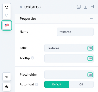
The following properties can be localized:
- Properties:
label,tooltip,placeholder,floating,description - Options:
text(checkbox, radio, toggle),on & off label(toggle),no options text&no results text(select, multiselect, tags) - Data:
data source / list / option labels(checkbox group, radio group, select, multiselect, tags),default(text, textarea, editor, hidden) - Decorators:
prefix,suffix,before,between,after
Setting Default and Fallback Locale
You can set a default and fallback locale in your configuration:
// builder.config.js

import { defineConfig } from '@vueform/builder'

export default defineConfig({
  locales: {
    en: 'English',
    de: 'German',
  },
  defaultLocale: 'en',  // default is 'en'
  fallbackLocale: 'en', // default is 'en'
})
Disabling Emoji Flags
By default, emoji flags are used for locale selection. To disable emoji flags and display ISO codes instead, you can configure the following:
// builder.config.js

import { defineConfig } from '@vueform/builder'

export default defineConfig({
  emojiFlags: false, // default is `true`
})
You can further customize the appearance of ISO codes using CSS with the .vfb-flag-{ISO} classes.
If you've already created a form with localized properties and later disable localization, make sure to convert those properties back to plain text before reloading the form into the builder.
Localizing the Builder
The Vueform Builder itself can be localized using the builderLocales property in builder.config.js:
// builder.config.js

import { defineConfig, nl_NL, ja_JP } from '@vueform/builder'

export default defineConfig({
  builderLocales: {
    nl_NL,
    ja_JP,
  },
})
The en_US locale is included by default. You only need to include other locales that you wish to use.
Currently, the builder supports the following locales:
en_US- English 🇺🇸hu_HU- Hungarian 🇭🇺ja_JP- Japanese 🇯🇵nl_NL- Dutch 🇳🇱sv_SE- Swedish 🇸🇪ar_JO- Arabic - Jordan 🇯🇴pt_PT- Portuguese 🇵🇹
To set the default builder locale, use the builderLocale property:
// builder.config.js

import { defineConfig, nl_NL, ja_JP } from '@vueform/builder'

export default defineConfig({
  builderLocale: 'nl_NL',
  builderLocales: {
    nl_NL,
    ja_JP,
  },
})
If you want to change the default fallback locale, use the builderFallbackLocale property:
// builder.config.js

import { defineConfig, nl_NL, ja_JP } from '@vueform/builder'

export default defineConfig({
  builderLocale: 'nl_NL',
  builderFallbackLocale: 'nl_NL',
  builderLocales: {
    nl_NL,
    ja_JP,
  },
})
Importing Locales for Vueform
Using builderLocales only localizes the builder interface. For a fully localized experience (including validator messages and country lists), include the relevant locales for Vueform itself in vueform.config.js:
// vueform.config.js

import { defineConfig } from '@vueform/vueform'
import en from '@vueform/vueform/locales/en'
import nl from '@vueform/vueform/locales/nl'
import ja from '@vueform/vueform/locales/ja'

export default defineConfig({
  locale: 'nl',
  fallbackLocale: 'nl',
  locales: {
    en,
    nl,
    ja,
  },
})
Vueform may use different locale keys (e.g.,
jainstead ofja_JP). Check available Vueform locales here.
Switching Builder Locales
To change the builder's locale at runtime, use the :builder-locale property on the <VueformBuilder> component:
<template>
  <VueformBuilder
    :builder-locale="builderLocale"
  />
</template>

<script setup>
import { ref } from 'vue'

const builderLocale = ref('nl_NL')

const changeLocale = (locale) => {
  builderLocale.value = locale
}
</script>
Alternatively, you can use the setBuilderLocale() method of the builder instance:
<template>
  <VueformBuilder
    ref="builder$"
  />
</template>

<script setup>
import { ref } from 'vue'

const builder$ = ref(null)

const changeLocale = (locale) => {
  builder$.value.setBuilderLocale(locale)
}
</script>

