Custom Config Panels
Learn how to create custom config panels for elements.
Config Panel Definition
In Custom Elements chapter we've learned how to create and register custom builder elements.
This chapter focuses on customizing and creating config panels for them using sections and separators:
// builder.config.js

import { defineConfig } from '@vueform/builder'

export default defineConfig({
  element: {
    types: {
      myType: {
        // ...
        sections: {
          // ...
        },
        separators: {
          // ...
        },
      }
    }
  }
})
Sections
The sections of each builder element follow this structure (unless Simple preset is used):
{
  // ...
  sections: {
    /**
     * General properties like name, label, placeholder, description.
     */
    properties: {
      name: 'properties',
      label: 'Properties',
      fields: {
        // ...
      },
    },

    /**
     * Element-specific properties like search options for select or
     * date constraints for date element, etc. Put here everything
     * that is unique to the element.
     */
    options: {
      name: 'options',
      label: 'Options',
      fields: {
        // ...
      },
    },

    /**
     * Everything that is related to the element's data. Eg. default
     * value, available options/items, etc. If the element is static
     * eg. a button you can leave out this part.
     */
    data: {
      name: 'data',
      label: 'Data',
      fields: {
        // ...
      },
    },

    /**
     * Configuration of decorators of the element, eg. prefix/suffix,
     * before/between/after contents.
     */
    decorators: {
      name: 'decorators',
      label: 'Decorators',
      fields: {
        // ...
      },
    },

    /**
     * Everything that is related to the look of the element, eg.
     * sizing, columns width, view options, etc.
     */
    layout: {
      name: 'layout',
      label: 'Layout',
      fields: {
        // ...
      },
    },

    /**
     * Configuration options related to validation rules, eg. field
     * name & validation rules. If the element is static
     * eg. a button you can leave out this part.
     */
    validation: {
      name: 'validation',
      label: 'Validation',
      fields: {
        // ...
      },
    },

    /**
     * It should contain everything related to rendering the element
     * conditionally.
     */
    conditions: {
      name: 'conditions',
      label: 'Conditions',
      fields: {
        // ...
      },
    },

    /**
     * If the element has native attributes (like `disabled` or
     * `readonly`) for `<input>` they can be put here.
     */
    attributes: {
      name: 'attributes',
      label: 'Attributes',
      fields: {
        // ...
      },
    },
  },
}
Each section must define a name, label, and fields:
properties: {
  name: 'properties',
  label: 'Properties',
  fields: {
    // ...
  }
}
The label can also be a translation tag provided by the builder locale, automatically resolved from the current locale:
properties: {
  name: 'properties',
  label: 'section_properties',
  fields: {
    // ...
  }
}
Fields
Sections contain fields, which are essential building blocks of Vueform Builder. They provide configuration options for elements:
import {
  TypeField,
  NameField,
  LabelField,
  InfoField,
  DescriptionField,
} from '@vueform/builder'

const sections = {
  properties: {
    name: 'properties',
    label: 'section_properties',
    fields: {
      type: { type: TypeField },
      name: { type: NameField },
      label: { type: LabelField },
      tooltip: { type: InfoField },
      description: { type: DescriptionField },
    }
  },
  // ...
}
Fields used for out-of-the-box builder elements are exported from @vueform/builder. The full list of existing fields and default element config panel sections and separators can be found at the end of this chapter, under Element Sections.
To customize the sections, separators, and fields of an existing element, a good start is to copy its default configuration from Element Sections.
For example, here's how we could set up the original configuration panel for the text element type (Text input):
// builder.config.js

import {
  defineConfig,
  elementTypes,

  TypeField,
  NameField,
  InputTypeField,
  LabelField,
  InfoField,
  PlaceholderField,
  DescriptionField,
  DefaultField_multilingual,
  SubmitField,
  AddonsField,
  BeforeField,
  BetweenField,
  AfterField,
  SizeField,
  ColumnsField,
  FieldNameField,
  ValidationField,
  ConditionsField,
  DisabledField,
  ReadonlyField,
  IdField,
  AutocompleteField,
  AttrsField,
} from '@vueform/builder'

export default defineConfig({
  element: {
    types: {
      text: {
        ...elementTypes.text,
        sections: {
          properties: {
            name: 'properties',
            label: 'section_properties',
            fields: {
              type: { type: TypeField },
              name: { type: NameField },
              inputType: { type: InputTypeField },
              label: { type: LabelField },
              tooltip: { type: InfoField },
              placeholder: { type: PlaceholderField },
              description: { type: DescriptionField },
            },
          },
          data: {
            name: 'data',
            label: 'section_data',
            fields: {
              default: { type: DefaultField_multilingual },
              submit: { type: SubmitField },
            },
          },
          decorators: {
            name: 'decorators',
            label: 'section_decorators',
            fields: {
              addons: { type: AddonsField },
              before: { type: BeforeField },
              between: { type: BetweenField },
              after: { type: AfterField },
            },
          },
          layout: {
            name: 'layout',
            label: 'section_layout',
            fields: {
              size: { type: SizeField },
              columns: { type: ColumnsField },
            },
          },
          validation: {
            name: 'validation',
            label: 'section_validation',
            fields: {
              fieldName: { type: FieldNameField },
              validation: { type: ValidationField },
            },
          },
          conditions: {
            name: 'conditions',
            label: 'section_conditions',
            fields: {
              conditions: { type: ConditionsField },
            },
          },
          attributes: {
            name: 'attributes',
            label: 'section_attributes',
            fields: {
              disabled: { type: DisabledField },
              readonly: { type: ReadonlyField },
              id: { type: IdField },
              autocomplete: { type: AutocompleteField },
              attrs: { type: AttrsField },
            },
          },
        }
      }
    }
  },
})
At this point, our text element type is identical to the original one in the builder, and if we were to leave it like that, nothing would change.
Separators
Separators can add dividers between fields.
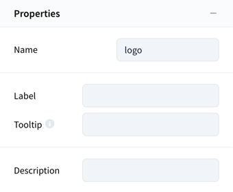
For example, this would add a divider between name / label and tooltip / description in the properties section:
separators: {
  properties: [
    ['type', 'name'], /* divider appears here */
    ['label', 'tooltip'], /* divider appears here */
    ['description'],
  ],
},
Alternatively:
// This will result in the same outcome, except the separator will be
// attached to the top of the 3rd section instead of the bottom of the 2nd.
// Useful if the 3rd section gets hidden under certain circumstances.
separators: {
  properties: [
    ['type', 'name'], /* divider appears here */
    ['label', 'tooltip'],
    /* divider appears here */ ['!', 'description'],
  ],
},
The result:
Let's add the original separators of the text element type to our customization example:
// builder.config.js

import {
  defineConfig,
  elementTypes,

  TypeField,
  NameField,
  InputTypeField,
  LabelField,
  InfoField,
  PlaceholderField,
  DescriptionField,
  DefaultField_multilingual,
  SubmitField,
  AddonsField,
  BeforeField,
  BetweenField,
  AfterField,
  SizeField,
  ColumnsField,
  FieldNameField,
  ValidationField,
  ConditionsField,
  DisabledField,
  ReadonlyField,
  IdField,
  AutocompleteField,
  AttrsField,
} from '@vueform/builder'

export default defineConfig({
  element: {
    types: {
      text: {
        ...elementTypes.text,
        sections: {
          properties: {
            name: 'properties',
            label: 'section_properties',
            fields: {
              type: { type: TypeField },
              name: { type: NameField },
              inputType: { type: InputTypeField },
              label: { type: LabelField },
              tooltip: { type: InfoField },
              placeholder: { type: PlaceholderField },
              description: { type: DescriptionField },
            },
          },
          data: {
            name: 'data',
            label: 'section_data',
            fields: {
              default: { type: DefaultField_multilingual },
              submit: { type: SubmitField },
            },
          },
          decorators: {
            name: 'decorators',
            label: 'section_decorators',
            fields: {
              addons: { type: AddonsField },
              before: { type: BeforeField },
              between: { type: BetweenField },
              after: { type: AfterField },
            },
          },
          layout: {
            name: 'layout',
            label: 'section_layout',
            fields: {
              size: { type: SizeField },
              columns: { type: ColumnsField },
            },
          },
          validation: {
            name: 'validation',
            label: 'section_validation',
            fields: {
              fieldName: { type: FieldNameField },
              validation: { type: ValidationField },
            },
          },
          conditions: {
            name: 'conditions',
            label: 'section_conditions',
            fields: {
              conditions: { type: ConditionsField },
            },
          },
          attributes: {
            name: 'attributes',
            label: 'section_attributes',
            fields: {
              disabled: { type: DisabledField },
              readonly: { type: ReadonlyField },
              id: { type: IdField },
              autocomplete: { type: AutocompleteField },
              attrs: { type: AttrsField },
            },
          },
        },
        separators: {
          properties: [
            ['type', 'name', 'inputType'],
            ['label', 'tooltip'],
            ['placeholder'],
            ['description'],
          ],
          decorators: [
            ['addons'],
            ['before', 'between', 'after'],
          ],
          layout: [
            ['size'],
            ['columns'],
          ],
          validation: [
            ['fieldName'],
            ['validation'],
          ],
          attributes: [
            ['disabled', 'readonly', 'id', 'autocomplete'],
            ['attrs'],
          ]
        }
      }
    }
  },
})
Still, if we leave things like this, nothing will change.
Example
As an example, let's create a new Name element that only has label and placeholder fields:
// builder.config.js

import {
  defineConfig,
  TypeField,
  LabelField,
  PlaceholderField,
} from '@vueform/builder'

export default defineConfig({
  element: {
    types: {
      name: {
        label: 'Name',
        description: 'Name of a person',
        category: 'fields',
        schema: {
          type: 'text',
          label: 'Name', // this will be the default Label when dragged into the form
          placeholder: 'Please enter your name', // this will be the default Placeholder when dragged into the form
        },
        sections: {
          properties: {
            name: 'properties',
            label: 'section_properties',
            fields: {
              type: { type: TypeField },
              label: { type: LabelField }, // Field for editing Label
              placeholder: { type: PlaceholderField }, // Field for editing Placeholder
            },
          },
        },
        separators: {
          properties: [
            ['type', 'label'],
            // Separator appears here
            ['placeholder'],
          ],
        }
      }
    }
  },
  elements: [
    'name'
  ]
})
Or a localized version:
// builder.config.js

import {
  defineConfig,
  TypeField,
  LabelField,
  PlaceholderField,
  en_US,
} from '@vueform/builder'

en_US.name_element_label = 'Name'
en_US.name_element_description = 'Name of a person'
en_US.name_element_schema_label = 'Name'
en_US.name_element_schema_placeholder = 'Please enter your name'

export default defineConfig({
  element: {
    types: {
      name: {
        label: 'name_element_label',
        description: 'name_element_description',
        category: 'fields',
        schema: {
          type: 'text',
          label: 'name_element_schema_label',
          placeholder: 'name_element_schema_placeholder',
        },
        sections: {
          properties: {
            name: 'properties',
            label: 'section_properties',
            fields: {
              type: { type: TypeField },
              label: { type: LabelField },
              placeholder: { type: PlaceholderField },
            },
          },
        },
        separators: {
          properties: [
            ['type', 'label'],
            // Separator appears here
            ['placeholder'],
          ],
        }
      }
    }
  },
  elements: [
    'name'
  ],
  builderLocales: {
    en_US,
  },
})
Now when this element is added to the form, it will have a default label and placeholder, which can be edited in the element's config panel.
Creating Fields
Custom element fields can be created by extending the BaseElementField class from @vueform/builder:
// CustomField.js

import { BaseElementField } from '@vueform/builder'

const CustomField = class extends BaseElementField {
  name = 'CustomField'

  get schema() {
    return {
      custom: {
        type: 'text'
      }
    }
  }
}

export default CustomField
The bare minimum a field needs to define is a name and a schema.
The name must be identical to the field's name.
The schema defines the options of the Vueform element that the field represents.
You can find the options of all Vueform elements in their official Components reference.
If we add this field to an element's config panel (sections), it will be displayed as a single-line text input:
// builder.config.js

import { defineConfig, TypeField } from '@vueform/builder'
import CustomField from './CustomField.js'

export default defineConfig({
  element: {
    types: {
      myType: {
        label: 'My element',
        description: 'My awesome element',
        category: 'fields',
        schema: {
          type: 'text',
        },
        sections: {
          properties: {
            name: 'properties',
            label: 'section_properties',
            fields: {
              type: { type: TypeField },
              custom: { type: CustomField },
            },
          },
        },
        separators: {}
      }
    }
  }
})
The result:

The
TypeFieldmust always be added to each element's configuration panel in thepropertiessection.
We may want to add some extra properties to our field, such as label, placeholder, and columns to provide more information for the user on what option they are editing:
// CustomField.js

import { BaseElementField } from '@vueform/builder'

const CustomField = class extends BaseElementField {
  name = 'CustomField'

  get schema() {
    return {
      custom: {
        type: 'text',
        label: 'Custom config',
        placeholder: 'Write here...',
        columns: { label: 6 }
      }
    }
  }
}

export default CustomField
The result:

When the user edits this "Custom config" field, it will edit the custom prop of the element because the get schema() of CustomField class returns an object with the custom key:

Adding Fields to Existing Element Types
It is also possible to add new fields to existing element types like text, email, select and so on.
The previous chapter described how we can override existing element types and now we will focus on the sections / separators.
Let's say that we want to add our CustomField to our text element type.
First, let's check what sections the text element has by default at Element Sections / text. We can see that it has properties, data, decorators, layout, validation, conditions and attributes sections. We decide to put our CustomField into the properties section as the last item:
// builder.config.js

import { defineConfig, elementTypes } from '@vueform/builder'
import CustomField from './CustomField.js'

// Cloning the sections of text
const textSections = { ...elementTypes.text.sections }

// Inserting the new field
textSections.properties.fields.custom = {
  type: CustomField,
}

// Cloning the separators of text
const textSeparators = { ...elementTypes.text.separators }

// Adding a separator between the last field and our new field
textSeparators.properties.push(['custom'])

export default defineConfig({
  element: {
    types: {
      text: {
        ...elementTypes.text,
        sections: textSections,
        separators: textSeparators,
      }
    }
  }
})
Inherited Sections and Separators
Sometimes you will find that certain element types have a string value for sections and separators. This is because some elements inherit these properties from another element like number, email or url inherits from text. In this case you have to import and extend the original element type's sections and separators.
Here's one way of doing this without having to manually check Element Sections each time (say we want to extend number that is based on text):
// builder.config.js

import { defineConfig, elementTypes } from '@vueform/builder'
import CustomField from './CustomField.js'

let numberSections = elementTypes.number.sections
let numberSeparators = elementTypes.number.separators

if (typeof numberSections === 'string') {
  numberSections = elementTypes[elementTypes.number.sections]?.sections
}

if (typeof numberSeparators === 'string') {
  numberSeparators = elementTypes[elementTypes.number.separators]?.separators
}

// Inserting the new field
numberSections.properties.fields.custom = {
  type: CustomField,
}

// Adding a separator between the last field and our new field
numberSeparators.properties.push(['custom'])

export default defineConfig({
  element: {
    types: {
      number: {
        ...elementTypes.number,
        sections: numberSections,
        separators: numberSeparators,
      }
    }
  }
})
In any case you can search for a certain element type in Element Sections and you will find what element type it originates from.
Multiple Options in the Same Field
A field can contain multiple configuration options:
// CustomField.js

import { BaseElementField } from '@vueform/builder'

const CustomField = class extends BaseElementField {
  name = 'CustomField'

  get schema() {
    return {
      custom1: {
        type: 'text',
        label: 'Custom config 1',
      },
      custom2: {
        type: 'textarea',
        label: 'Custom config 2',
      },
    }
  }
}

export default CustomField
They will edit the custom1 and custom2 props of the element they are assigned to.
We can also wrap them into an object and set wrapped = true to resolve them as separate props:
// CustomField.js

import { BaseElementField } from '@vueform/builder'

const CustomField = class extends BaseElementField {
  name = 'CustomField'

  wrapped = true

  get schema() {
    return {
      custom_wrapper: {
        type: 'object',
        label: 'Custom config wrapper',
        schema: {
          custom1: {
            type: 'text',
            placeholder: 'Config 1',
            columns: 6,
          },
          custom2: {
            type: 'text',
            placeholder: 'Config 2',
            columns: 6,
          },
        }
      }
    }
  }
}

export default CustomField
They will also edit the custom1 and custom2 props of the element they are assigned to.
Default Value
By adding default to our CustomField's schema, it will set the default value for the field when the element's config panel is opened if that prop does not have a value:
// CustomField.js

import { BaseElementField } from '@vueform/builder'

const CustomField = class extends BaseElementField {
  name = 'CustomField'

  get schema() {
    return {
      custom: {
        type: 'text',
        label: 'Custom config',
        placeholder: 'Write here...',
        columns: { label: 6 },
        default: 'Default value',
      }
    }
  }
}

export default CustomField
This also means that when the CustomField's value is changed and then later set back to Default value, the custom prop will be removed from the element.
Using Element Schema Options in Field Schema
To access a property from the element's schema within your field schema, you can use this.elementSchema:
// CustomField.js

import { BaseElementField } from '@vueform/builder'

const CustomField = class extends BaseElementField {
  name = 'CustomField'

  get schema() {
    const elLabel = this.elementSchema.label

    return {
      custom: {
        type: 'text',
        label: `Custom config for ${elLabel}`,
      }
    }
  }
}

export default CustomField
The this.elementSchema property provides reactive access to any value defined in the element's schema. This means that if any part of the element schema changes—such as label in this example—the field’s schema getter will automatically re-evaluate and update accordingly.
Field Types
Text Fields
Here's an example of how you can add a text element to a custom field:
// CustomField.js

import { BaseElementField } from '@vueform/builder'

const CustomField = class extends BaseElementField {
  name = 'CustomField'

  get schema() {
    return {
      custom: {
        type: 'text',
        label: 'Custom config',
        columns: { label: 6 },
      },
    }
  }
}

export default CustomField
The textarea and editor types can be used the same way.
Toggle Field
Here's an example of how you can add a toggle element to a custom field:
// CustomField.js

import { BaseElementField } from '@vueform/builder'

const CustomField = class extends BaseElementField {
  name = 'CustomField'

  get schema() {
    return {
      custom: {
        type: 'toggle',
        label: 'Custom config',
        columns: { label: 9 },
        default: true,
      },
    }
  }
}

export default CustomField
Tabs Field
Here's an example of how you can add a radiogroup or checkboxgroup tabs selector to a custom field:
// CustomField.js

import { BaseElementField } from '@vueform/builder'

const CustomField = class extends BaseElementField {
  name = 'CustomField'

  get schema() {
    return {
      custom: {
        type: 'radiogroup',
        label: 'Custom config',
        view: 'tabs',
        presets: ['tabs-tiny', 'tabs-3'],
        columns: { label: 6 },
        items: [
          { value: 1, label: 'Tab 1' },
          { value: 2, label: 'Tab 2' },
          { value: 3, label: 'Tab 3' },
        ],
        default: 1,
      },
    }
  }
}

export default CustomField
You can change type from radiogroup to checkboxgroup if you want to allow multiple tabs. In that case, you need to make default an array.
You may replace the tabs-3 preset with one of the following to display equally sized tabs:
tabs-2tabs-3tabs-4tabs-6tabs-12
List Field
Here's how you can add a list to a custom field:
// CustomField.js

import { BaseElementField } from '@vueform/builder'

const CustomField = class extends BaseElementField {
  name = 'CustomField'

  get schema() {
    return {
      custom: {
        type: 'list',
        label: 'Custom list',
        element: {
          type: 'text',
          placeholder: 'Custom item',
        },
      },
    }
  }
}

export default CustomField
To learn how to create key/value pairs with the list element, check out the Custom Save and Load Methods section.
Select Fields
Here's an example of how you can add a select element to a custom field:
// CustomField.js

import { BaseElementField } from '@vueform/builder'

const CustomField = class extends BaseElementField {
  name = 'CustomField'

  get schema() {
    return {
      custom: {
        type: 'select',
        label: 'Custom config',
        columns: { label: 6 },
        search: true,
        items: [
          'Batman',
          'Spiderman',
          'Superman',
        ]
      },
    }
  }
}

export default CustomField
Async Select
Here's an example of how you can add an async select element to a custom field while ensuring the values are loaded back properly:
// CustomField.js

import { BaseElementField } from '@vueform/builder'

const CustomField = class extends BaseElementField {
  name = 'CustomField'

  get schema() {
    return {
      custom: {
        type: 'select',
        label: 'Custom config',
        columns: { label: 6 },
        search: true,
        items: async (query, input) => {
          // This can be replaced with any async/await calls
          // eg. loading data from a server endpoint
          return new Promise((resolve, reject) => {
            setTimeout(() => {
              resolve([
                'Batman',
                'Spiderman',
                'Superman',
              ])
            }, 500)
          })
        }
      },
    }
  }
}

export default CustomField
You can find alternative ways of defining select
itemson its component reference at vueform.com.
Dependent Selects
Here's an example of how you can add two select elements to a field where the option list of the second one depends on the selected value of the first:
const CustomField = class extends BaseElementField {
  name = 'CustomField'

  get schema() {
    const universes = [
      'Marvel', 'DC',
    ]

    const characters = {
      Marvel: ['Deadpool', 'Hulk', 'Thor'],
      DC: ['Batman', 'Spiderman', 'Superman'],
    }

    return {
      universe: {
        type: 'select',
        label: 'Universe',
        items: universes,
        search: true,
        onChange: (newValue, oldValue, el$) => {
          // Retrieving the `character` select element.
          // The `this.section` resolves to the key of the section where the field is used,
          // e.g. `properties` in our example. If the other select element is in a different
          // field/section, you can use its section name to reference it.
          const character$ = el$.form$.el$(`${this.section}.character`)

          // Manually overriding the `character` select's
          // options and making sure labels are refreshed.
          character$.input.resolvedOptions = characters[newValue]
          character$.input.refreshLabels()

          // If you ever use the `onChange` event for a root element in `schema`,
          // make sure to add `this.save(...)` when `this.isLoading` is `false`.
          // ---
          // This is the default behavior added to each root field's `onChange` methods
          // that you need to manually define if you override it.
          // ---
          // It basically means that if the element's config panel is not currently
          // being opened (loaded), it should save any changes made to the field.
          if (!this.isLoading) {
            // This is the method you need to add when using `onChange`.
            this.save(newValue, oldValue, el$.name, el$)

            // This is another call, custom to our field.
            // If a change happens to our select, the dependent selector
            // needs to be cleared as it may contain values it shouldn't.
            character$.clear()
          }
        }
      },
      character: {
        type: 'select',
        label: 'Character',
        search: true,
        // Make sure to add `allowAbsent` as it allows
        // loading values before they are part of `items`
        allowAbsent: true,
        // Let `items` be an empty array by default that will
        // get manually filled in by the parent selector.
        items: [],
      },
    }
  }
}
Multilingual Fields
Some elements, such as text, textarea, and editor, can be used as multilingual fields when locales are used:

The BaseMultilingualElementField provides a multilingual property, which we can use to determine whether a translatable version of the element should be included in the field:
// CustomField.js

import { BaseMultilingualElementField } from '@vueform/builder'

const CustomField = class extends BaseMultilingualElementField {
  name = 'CustomField'

  get schema() {
    return {
      custom: {
        type: this.multilingual ? 't-text' : 'text',
        label: 'Custom config',
        placeholder: 'Write here...',
        columns: { label: 6 },
        default: 'Default value',
      }
    }
  }
}

export default CustomField
Besides the multilingual prop, fallbackLocale, fallbackLocaleName, and locale.value props are also available in this field type.
The same can be used for textarea and editor elements.
Subtitle Field
Here's how you can add a subtitle field using a static element:
// CustomField.js

import { BaseElementField } from '@vueform/builder'

const CustomField = class extends BaseElementField {
  name = 'CustomField'

  get schema() {
    return {
      custom: {
        type: 'static',
        content: 'My subtitle',
        presets: ['prop-subtitle'],
      }
    }
  }
}

export default CustomField
Its sole purpose is to give more visual separation between field blocks within a section and will not add any prop to the element.
Field Separator
To add a horizontal separator line above or below an element, include either separator-top or separator in the element's presets array:
// CustomField.js

import { BaseElementField } from '@vueform/builder'

const CustomField = class extends BaseElementField {
  name = 'CustomField'

  get schema() {
    return {
      custom: {
        type: 'text',
        presets: ['separator'], // or `separator-top`
      }
    }
  }
}

export default CustomField
As a best practice, use separator-top on elements that are conditionally displayed. This ensures the separator only appears when the element is rendered, rather than placing a separator on the element above, which may remain visible regardless of conditions.
Conditional Fields
Here's an example of how you can display a field conditionally based on another field's value:
// CustomField.js

import { BaseElementField } from '@vueform/builder'

const CustomField = class extends BaseElementField {
  name = 'CustomField'

  get schema() {
    return {
      custom_toggle: {
        type: 'toggle',
        label: 'Custom toggle',
        columns: { label: 9 },
        default: false,
      },
      custom_text: {
        type: 'text',
        label: 'Custom text',
        placeholder: 'Write here...',
        columns: { label: 6 },
        default: 'Default value',
        conditions: [
          // The `this.section` resolves to the key of the section where the field is used
          // eg. `properties` in our example. If you other element is in a different
          // field/section, you can use it's section name to reference it.
          [`${this.section}.custom_toggle`, true]
        ]
      },
    }
  }
}

export default CustomField
The custom_text field will only appear if custom_toggle is set to true.
The problem is, that if you fill in custom_text and then set custom_toggle to false, the input will disappear but the custom_text value remains added to the element's schema. This is not the intended behavior, as custom_text should only ever exist if custom_toggle is true.
We can tackle this in two ways. The first is to wrap them into an object and set wrapped = true, so that any child element's change will trigger the save event of the whole field:
// CustomField.js

import { BaseElementField } from '@vueform/builder'

const CustomField = class extends BaseElementField {
  name = 'CustomField'

  wrapped = true

  get schema() {
    return {
      custom_wrapper: {
        type: 'object',
        schema: {
          custom_toggle: {
            type: 'toggle',
            label: 'Custom toggle',
            columns: { label: 9 },
            default: false,
          },
          custom_text: {
            type: 'text',
            label: 'Custom text',
            placeholder: 'Write here...',
            columns: { label: 6 },
            default: 'Default value',
            conditions: [
              // Notice we added `custom_wrapper` to the path
              [`${this.section}.custom_wrapper.custom_toggle`, true]
            ]
          },
        }
      }
    }
  }
}

export default CustomField
The second way is to add watchers that watch for changes on one element and retrigger the save method on another. Read on to learn how to use them.
Modals
It is possible to create custom modals that are similar to eg. Conditions editor.
You can find the full live example here.
Creating the Modal
First let's create our CustomModal.vue component that can define a list of options with key and value properties:
<!-- CustomModal.vue -->
<template>
  <BuilderModal title="Custom Modal" @close="handleClose">
    <template #default>
      <!-- Show a form if it has data -->
      <div v-show="data.length">
        <Vueform v-bind="form" ref="form$" />
      </div>

      <!-- Otherwise display a placeholder -->
      <div v-show="!data.length" class="vfb-custom-modal-empty-wrapper">
        <div class="vfb-custom-modal-empty-icon">
          <builder-icon :icon="['fas', 'list']" />
        </div>

        <div class="vfb-custom-modal-empty-title">No custom modal options</div>
        <div class="vfb-custom-modal-empty-subtitle">
          Custom modal options list is empty
        </div>

        <div
          @click.prevent="handleAdd"
          @keypress.enter.space="handleAdd"
          class="vfb-btn-primary"
        >
          + Add
        </div>
      </div>
    </template>

    <template #footer>
      <div class="vfb-modal-buttons">
        <div class="vfb-modal-buttons-left">
          <div
            @click.prevent="handleSave"
            @keypress.enter.space="handleSave"
            class="vfb-btn-primary"
            tabindex="0"
            role="button"
          >
            Save
          </div>
          <div
            @click.prevent="handleReset"
            @keypress.enter.space="handleReset"
            class="vfb-btn-secondary"
            tabindex="0"
            role="button"
          >
            Reset
          </div>
        </div>
        <div
          @click.prevent="handleClose"
          @keypress.enter.space="handleClose"
          class="vfb-btn-transparent !outline-none"
          tabindex="0"
          role="button"
        >
          Cancel
        </div>
      </div>
    </template>
  </BuilderModal>
</template>

<script setup>
import { ref, inject, onMounted, nextTick, computed } from 'vue';

// ============= DEFINITIONS =============

const emit = defineEmits(['close']);

const { builder$ } = defineProps({
  builder$: {
    type: Object,
    required: true,
  },
});

// =============== INJECT ================

/**
 * Global vueform config object that can be extended via plugins.
 * This can be useful if you need to store data, eg. a fix list of options.
 */
const $vueform = inject('$vueform');

// ================ DATA =================

const form$ = ref();

const form = ref({
  endpoint: false,
  displayErrors: false,
  replaceClasses: {
    ListElement: {
      handle: {
        'top-0': 'top-[1.375rem]',
        'left-0': 'left-0.5',
      },
    },
  },
  schema: {
    modalOptions: {
      type: 'list',
      initial: 0,
      sort: true,
      addText: '+ Add',
      object: {
        schema: {
          key: {
            type: 'text',
            placeholder: 'Key',
            rules: 'required',
            columns: 6,
          },
          value: {
            type: 'text',
            placeholder: 'Value',
            rules: 'required',
            columns: 6,
          },
        },
      },
    },
  },
});

// ============== COMPUTED ===============

const data = computed(() => {
  return form$.value?.data?.modalOptions || [];
});

/**
 * The currently selected element's schema.
 */
const schema = computed(() => {
  return builder$.selectedElementSchema
})

/**
 * This is how you can read the params of the modal (we will set this at a later step).
 */
const params = computed(() => {
  return builder$.modals['custom-modal']
})

// =============== METHODS ===============

const handleAdd = () => {
  form$.value.el$('modalOptions').add(undefined, true);
};

const handleSave = async () => {
  await form$.value.validate();

  if (form$.value.invalid) {
    return;
  }

  // updates the currently open element's schema
  if (data.value.length) {
    builder$.updateBuilder(
      'schema',
      {
        modalOptions: data.value, // only change this
      },
      {
        path: builder$.selectedElement,
      }
    );
  } else {
    builder$.removeFromBuilder('schema',
      ['modalOptions'], // only change this
    {
      path: builder$.selectedElement,
    });
  }

  builder$.refreshConfigPanel(builder$.schema);

  emit('close');

  // This is how you can interact with the preview form
  builder$.preview$.form$.clear();
};

const handleReset = () => {
  form$.value.reset();

  nextTick(() => {
    form$.value.resetValidators();
  });
};

const handleClose = () => {
  emit('close');
};

// ================ HOOKS ================

onMounted(() => {
  // Loading the initial data to our form when the modal is opened based on the element's schema
  form$.value.update({
    modalOptions: schema.value.modalOptions || [],
  });
});
</script>

<style lang="scss">
.vfb-custom-modal-empty-wrapper {
  @apply mb-4 text-center;
}

.vfb-custom-modal-empty-icon {
  @apply mx-auto w-16 h-16 text-2xl bg-primary-500 text-primary-500 bg-opacity-20 rounded-full flex items-center justify-center;
}

.vfb-custom-modal-empty-title {
  @apply font-semibold text-lg mt-2;
}

.vfb-custom-modal-empty-subtitle {
  @apply text-gray-500 leading-none mb-4 dark:text-dark-400;
}
</style>
Registering the Modal
Next, we have to register our modal in builder.config.js:
// builder.config.js

import { defineConfig } from '@vueform/builder';
import CustomModal from './src/components/CustomModal.vue';

export default defineConfig({
  // ...
  modals: {
    'custom-modal': CustomModal,
  },
});
Creating a Field for the Modal
Now we have to create a field that:
- lists the data set via the modal
- contains a button that can open the modal.
First let's create a ModalDisplay.vue component that will display the value of the modalOptions prop created by the modal:
<!-- ModalDisplay.vue -->
<template>
  <div
    class="flex justify-between items-start bg-gray-50 border border-gray-200 px-3 py-2 rounded-md dark:bg-dark-700 dark:border-dark-700"
  >
    <div class="mt-0.5">
      <template v-if="modalOptions.length">
        <div v-for="modalOption in modalOptions">
          <b>{{ modalOption.key }}</b
          >: {{ modalOption.value }}
        </div>
      </template>
      <div v-else>No modal options</div>
    </div>
    <div class="vfb-btn-primary vfb-btn-xs" @click="handleEdit">
      {{ modalOptions.length ? 'Edit' : '+ Add' }}
    </div>
  </div>
</template>

<script>
import { toRefs, inject, computed } from 'vue';

export default {
  name: 'ModalDisplay',
  setup(props, context) {
    // This is the instance of the element that will use this display
    const { el$ } = toRefs(props);

    // =============== INJECT ================

    // Uncomment in case you need access to global $vueform
    // const $vueform = inject('$vueform');

    // ============== COMPUTED ===============

    /**
     * Reading the `modalOptions` from `attrs` property (we will define this in the next step).
     */
    const modalOptions = computed(() => {
      return el$.value.attrs.modalOptions || [];
    });

    // =============== METHODS ===============

    const handleEdit = () => {
      el$.value.handleEvent('open-modal',
        'custom-modal', // this is the name our modal was registered under
        true, // this is whether the opening of the modal should be announced by screen readers—leave it always true
        {
          foo: 'bar', // this is how you can pass params to the modal
        }
      );
    };

    return {
      handleEdit,
      modalOptions,
    };
  },
};
</script>
Now that we have a display component let's create ModalField.js as a static element and assign this component to that as a default slot. This field is going to change the modalOptions property of the element's schema:
// ModalField.js
import { markRaw } from 'vue';
import { BaseElementField } from '@vueform/builder';
import ModalDisplay from './../components/ModalDisplay.vue';

export default class ModalField extends BaseElementField {
  name = 'ModalField';

  get schema() {
    const emit = this.emit;

    return {
      modalOptions: {
        type: 'static',
        attrs: {
          modalOptions: this.elementSchema.modalOptions, // passing the `modalOptions` to the our display component
        },
        slots: {
          default: markRaw(ModalDisplay),
        },
        handleEvent() {
          emit('event', ...arguments); // forwarding the events like `open-modal` to parent
        },
      },
    };
  }
}
In this example we have used a static element with default slot but you could also use a custom element type if you need further customization.
Registering the Field
Now the next thing is to add this new field to an element's config panel. Let's say that we want to add this field to the existing text element type.
First, let's check what sections the text element has by default at Element Sections / text. We can see that it has properties, data, decorators, layout, validation, conditions and attributes sections. We decide to put this field into the properties section as the last item.
Previously we have learned how to add fields to existing element types so we can use this knowledge to add our ModalField to the text element:
// builder.config.js

import { defineConfig, elementTypes } from '@vueform/builder'
import CustomModal from './src/components/CustomModal.vue';
import ModalField from './src/fields/ModalField.js'

// Cloning the sections of text
const textSections = { ...elementTypes.text.sections }

// Inserting the new field
textSections.properties.fields.modalOptions = {
  type: ModalField,
}

// Cloning the separators of text
const textSeparators = { ...elementTypes.text.separators }

// Adding a separator between the last field and our new field
textSeparators.properties.push(['modalOptions'])

export default defineConfig({
  // ...
  modals: {
    'custom-modal': CustomModal,
  },
  element: {
    types: {
      text: {
        ...elementTypes.text,
        sections: textSections,
        separators: textSeparators,
      }
    }
  }
})
At this point we should have:
- our
ModalDisplaycomponent show up at thePropertiessection of thetextelement type - it should open
CustomModalthat sets themodalOptionsprop of ourtextelement - the
ModalDisplayshould display the values set in the modal.
One last thing we should do is to add modalOptions prop to our text element. Because right now it is being set to its schema but we aren't doing anything with it and defining it as a prop is something we should do at least.
Adding New Props to Existing Element
We can extend our TextElement using a plugin so let's add a modalOptions prop to it in vueform.config.js that we can later use for whatever we want:
// vueform.config.js

export default {
  // ...
  plugins: [
    // ...
    {
      apply: 'TextElement',
      props: {
        modalOptions: {
          type: Array,
          default: () => [],
        },
      },
    },
  ],
};
Watchers
Watchers can be used to watch for a change in a field's element(s) and do something on another field.
Sticking with our previous example, we can watch for the change on custom_toggle and retrigger the save on custom_text to ensure custom_text is only added to the element's schema if the custom_toggle is true:
// CustomField.js

import { BaseElementField } from '@vueform/builder'

const CustomField = class extends BaseElementField {
  name = 'CustomField'

  watchers = {
    // Full path of the field element that needs to watch for something.
    // This is `custom_text` in our example, as that needs to look for
    // changes in `custom_toggle`.
    [`${this.section}.custom_text`]: [
      // List of watchers
      [
        // The first item of the array must be the field or fields in the
        // same section that need to be watched without the section prefix.
        ['custom_toggle'],

        // The second item should be the handler function (can be async) and it receives:
        // - el$: the instance of the watcher element (`custom_text` in our example)
        // - newValue: the new value or values of the watched elements
        // - oldValue: the old value or values of the watched elements
        (el$, newValue, oldValue) => {
          // [0] as `custom_toggle` is the first element of the watched elements
          if (!newValue[0]) {

            // If the toggle is off, reset `custom_text` to default
            // which removes its value from the element's schema
            el$.reset()
          }
        }
      ],
    ]
  }

  get schema() {
    return {
      custom_toggle: {
        type: 'toggle',
        label: 'Custom toggle',
        columns: { label: 9 },
        default: false,
      },
      custom_text: {
        type: 'text',
        label: 'Custom text',
        placeholder: 'Write here...',
        columns: { label: 6 },
        default: 'Default value',
        conditions: [
          [`${this.section}.custom_toggle`, true]
        ]
      },
    }
  }
}

export default CustomField
The only caveat is that watchers can only watch fields within the same section. While you need to prefix the path in the watcher object key with the section key, it doesn’t need to be prefixed in the target field(s)’ path. The this.section resolves to the section the field is used in.
Custom OnChange Event
If you ever need to use an onChange event on an element defined at the root level of a field, make sure to add the following:
// CustomField.js

import { BaseElementField } from '@vueform/builder'

const CustomField = class extends BaseElementField {
  name = 'CustomField'

  get schema() {
    return {
      custom: {
        type: 'text',
        onChange: (newValue, oldValue, el$) => {
          // Your change handler...

          // Make sure to include this
          if (!this.isLoading) {
            this.save(newValue, oldValue, el$.name, el$)
          }
        }
      },
    }
  }
}

export default CustomField
Vueform Builder automatically assigns an onChange method to all root field elements, which is how it saves the input value to the element schema. If an element already has an onChange method defined, it will skip the default behavior. That’s why we need to add this logic to make sure it gets saved.
Custom Save and Load Methods
Sometimes, you may need to format element properties differently from the default field output. For instance, if you want to create an object of key/value pairs as a prop, some transformation will likely be required.
In such cases, you can override the BaseElementField's save() and load() methods.
Saving
Take the example of a list element with key and value text input children:
// CustomField.js

import { BaseElementField } from '@vueform/builder'

const CustomField = class extends BaseElementField {
  name = 'CustomField'

  get schema() {
    return {
      custom: {
        type: 'list',
        object: {
          schema: {
            key: {
              type: 'text',
              placeholder: 'Key',
              columns: 6,
            },
            value: {
              type: 'text',
              placeholder: 'Value',
              columns: 6,
            },
          }
        }
      },
    }
  }
}

export default CustomField
This field would set the following value for custom:
<CustomElement
  :custom="[
    { key: 'key1', value: 'Value 1' },
    { key: 'key2', value: 'Value 2' },
  ]"
/>
However, the desired output format is:
<CustomElement
  :custom="{
    key1: 'Value 1',
    key2: 'Value 2',
  }"
/>
To achieve this, we can override the CustomField's save() method to transform the array output of the list element into an object:
// CustomField.js

import { BaseElementField } from '@vueform/builder'

const CustomField = class extends BaseElementField {
  name = 'CustomField'

  get schema() {
    return {
      custom: {
        type: 'list',
        object: {
          schema: {
            key: {
              type: 'text',
              placeholder: 'Key',
              columns: 6,
            },
            value: {
              type: 'text',
              placeholder: 'Value',
              columns: 6,
            },
          }
        }
      },
    }
  }

  save(newValue, oldValue, key, el$) {
    const update = {}
    const remove = []

    // If the `list` has items
    if (newValue.length) {
      // Transform the array into an object
      update.custom = newValue.reduce((prev, curr) => {
        const carry = { ...prev }

        // Only add the item if it has a valid `key`
        if (curr.key !== '' && curr.key !== null) {
          carry[curr.key] = curr.value
        }

        return carry
      }, {})
    }

    // If no valid items exist, remove the `custom` prop
    if (!Object.keys(update.custom)?.length) {
      remove.push('custom')
    }

    // Perform the update/removal
    this.update(update, remove)
  }
}

export default CustomField
The save() method is triggered when a root element (as defined in the schema) changes. It takes the following parameters:
newValue— the new value of the element.oldValue— the previous value of the element.key— the key of the element that was changed.el$— the instance of the element that was changed.
At the end of the save() method, we call this.update(update, remove) to trigger the actual saving of the field’s value.
updateis an object where each key corresponds to a prop of the element that should be updated (in this case,custom).removeis an array containing the names of the props that should be removed from the element (e.g.,customif the list has no valid items).
Loading
When the element's configuration panel is opened, the props are loaded into the config panel form using the load() method.
Since the structure of the stored data differs from what the config panel fields expect, you need to override load() and transform the data back into the list structure:
// CustomField.js

import { BaseElementField } from '@vueform/builder'

const CustomField = class extends BaseElementField {
  name = 'CustomField'

  get schema() {
    return {
      custom: {
        type: 'list',
        object: {
          schema: {
            key: {
              type: 'text',
              placeholder: 'Key',
              columns: 6,
            },
            value: {
              type: 'text',
              placeholder: 'Value',
              columns: 6,
            },
          }
        }
      },
    }
  }

  save(newValue, oldValue, key, el$) {
    // ...our previously implemented `save()` method
  }

  load(data) {
    const load = {}

    // If the element has a `custom` prop
    if (data.custom) {
      // Transform the object back into an array of objects
      load.custom = Object.keys(data.custom).map((key) => ({
        key,
        value: data.custom[key],
      }))
    }

    return load
  }
}

export default CustomField
The load() method is triggered each time the element's config panel opens. It takes one argument:
data— an object containing all properties of the element.
The load() method should return an object whose properties correspond to the root elements of the field. If any of the root element keys are missing from the returned object, those elements will be empty when the config panel is opened.
Reusing Fields
Sometimes, we may want to reuse a field with slight modifications in its schema.
Using Inheritance
One way to achieve this is by extending CustomFieldA in CustomFieldB and using baseSchema:
// CustomFieldA.js

import { BaseElementField } from '@vueform/builder'

const CustomFieldA = class extends BaseElementField {
  name = 'CustomFieldA'

  get baseSchema() {
    return {
      custom: {
        type: 'text',
        // ...other props
      },
    }
  }

  get schema() {
    return this.baseSchema
  }

  save(newValue, oldValue, key, el$) {
    // ...custom save
  }

  load(data) {
    // ...custom load
  }
}

const CustomFieldB = class extends CustomFieldA {
  name = 'CustomFieldB'

  get schema() {
    const schemaA = this.baseSchema
    const schemaB = { ...schemaA }

    schemaB.custom.type = 'textarea'

    return schemaB
  }
}
Using Named Exports
Alternatively, you can export schema and use .call(this) to retrieve its value in CustomFieldB if extending the class from CustomFieldA is not preferred:
// CustomFieldA.js

import { BaseElementField } from '@vueform/builder'

const schema = function () {
  return {
    custom: {
      type: 'text',
      // ...other props
    },
  }
}

const save = function (newValue, oldValue, key, el$) {
  // ...custom save
}

const load = function (data) {
  // ...custom load
}

const CustomFieldA = class extends BaseElementField {
  name = 'CustomFieldA'

  get schema() {
    return schema.call(this)
  }

  save(newValue, oldValue, key, el$) {
    save.call(this, newValue, oldValue, key, el$)
  }

  load(data) {
    load.call(this, data)
  }
}

export default CustomFieldA

export {
  schema,
  save,
  load,
}// CustomFieldB.js
import { BaseElementField } from '@vueform/builder'
import {
schema as schemaA,
save as saveA,
load as loadA,
} from './CustomFieldA.js'
const CustomFieldB = class extends BaseElementField {
name = 'CustomFieldB'
get schema() {
const schemaB = { ...schemaA.call(this) }
schemaB.custom.type = 'textarea'
return schemaB
}
save(newValue, oldValue, key, el$) {
saveA.call(this, newValue, oldValue, key, el$)
}
load(data) {
loadA.call(this, data)
}
}
export default CustomFieldBBase Properties and Methods
In this section, you can find the props and methods of BaseElementField and its descendants.
Properties
| Name | Type | Description |
|---|---|---|
config$ | object | The global builder config object. |
device | Computed | The currently selected device. Can be used with this.device.value. |
elementSchema | object | The schema of the selected element. |
elementType | string | The builder element type. |
extend | object | The object that extends the field schema's first root element. |
field | object | The field definition object. |
fieldName | string | The name of the field provided via the definition object as the name property. |
formSchema | object | The form's schema. |
isLoading | boolean | Whether the field's value is currently being loaded (the element's config panel is being opened). |
locale | Computed | The currently selected form locale. Can be used with this.locale.value. |
pagedTree | object | The form tree, including pages. |
section | string | The name of the section containing the field. |
selectedElement | string | The full path of the currently selected element. |
selectedPage | string | The name of the selected page if the field is assigned to tab / step configuration panel. |
settingsLocale | string | The locale of the settings panel (aka builderLocale). |
tags | object | The translation tags from the current locale. |
$vueform | object | Vueform's global config object. |
vueformElementType | string | The Vueform element type. |
builder$ | object | The instance of VueformBuilder (as a computed). |
Methods
| Name | Params | Return | Description |
|---|---|---|---|
getElementSchemaByPath() | schema, path | object | Returns the schema of a form element based on its path. |
getOtherPaths() | - | array | Returns the paths of all other form elements, excluding the current one. |
load() | data | object | Determines what data should be loaded into the config field when the config panel is opened. See example |
save() | newValue, oldValue, key, el$ | void | Triggered when any of the root schema elements is changed. It decides what fields to update or remove from the element's props. See example |
update() | update, remove | void | Updates or removes element props. See example |
Element Sections
Here's the full list of existing element sections and separators configurations. You might reuse any of the existing config fields for your custom element.
button
Used by the following element types:
submit(Submit button)reset(Reset button)primaryButton(Primary button)secondaryButton(Secondary button)dangerButton(Danger button)
import {
  TypeField,
  NameField,
  LabelField,
  InfoField,
  DescriptionField,
  ButtonLabelField,
  ButtonTypeField,
  SubmitsField,
  ResetsField,
  HrefField,
  TargetField,
  BeforeField,
  BetweenField,
  AfterField,
  FullField,
  AlignField,
  SizeField,
  ColumnsField,
  ConditionsField,
  DisabledField,
  IdField,
} from '@vueform/builder'

export default {
  sections: {
    properties: {
      name: 'properties',
      label: 'section_properties',
      fields: {
        type: { type: TypeField },
        name: { type: NameField },
        label: { type: LabelField },
        tooltip: { type: InfoField },
        description: { type: DescriptionField },
      },
    },
    options: {
      name: 'options',
      label: 'section_button_options',
      fields: {
        buttonLabel: { type: ButtonLabelField },
        buttonType: { type: ButtonTypeField },
        submits: { type: SubmitsField },
        resets: { type: ResetsField },
        href: { type: HrefField },
        target: { type: TargetField },
      },
    },
    decorators: {
      name: 'decorators',
      label: 'section_decorators',
      fields: {
        before: { type: BeforeField },
        between: { type: BetweenField },
        after: { type: AfterField },
      },
    },
    layout: {
      name: 'layout',
      label: 'section_layout',
      fields: {
        full: { type: FullField },
        align: { type: AlignField },
        size: { type: SizeField },
        columns: { type: ColumnsField },
      },
    },
    conditions: {
      name: 'conditions',
      label: 'section_conditions',
      fields: {
        conditions: { type: ConditionsField },
      },
    },
    attributes: {
      name: 'attributes',
      label: 'section_attributes',
      fields: {
        disabled: { type: DisabledField },
        id: { type: IdField },
      },
    },
  },
  separators: {
    properties: [
      ['type', 'name'],
      ['label', 'tooltip'],
      ['description'],
    ],
    options: [
      ['buttonLabel'],
      ['buttonType'],
      ['submits', 'resets'],
      ['!', 'href', 'target'],
    ],
    layout: [
      ['full'],
      ['align'],
      ['size'],
      ['columns'],
    ],
    attributes: [
      ['disabled', 'id'],
    ],
  }
}
captcha
Used by the following element types:
captcha(Captcha)
import {
  TypeField,
  NameField,
  LabelField,
  InfoField,
  PlaceholderField,
  DescriptionField,
  SubmitField,
  BeforeField,
  BetweenField,
  AfterField,
  ColumnsField,
  ConditionsField,
} from '@vueform/builder'

export default {
  sections: {
    properties: {
      name: 'properties',
      label: 'section_properties',
      fields: {
        type: { type: TypeField },
        name: { type: NameField },
        label: { type: LabelField },
        tooltip: { type: InfoField },
        placeholder: { type: PlaceholderField },
        description: { type: DescriptionField },
      },
    },
    data: {
      name: 'data',
      label: 'section_data',
      fields: {
        submit: { type: SubmitField },
      },
    },
    decorators: {
      name: 'decorators',
      label: 'section_decorators',
      fields: {
        before: { type: BeforeField },
        between: { type: BetweenField },
        after: { type: AfterField },
      },
    },
    layout: {
      name: 'layout',
      label: 'section_layout',
      fields: {
        columns: { type: ColumnsField },
      },
    },
    conditions: {
      name: 'conditions',
      label: 'section_conditions',
      fields: {
        conditions: { type: ConditionsField },
      },
    },
  },
  separators: {
    properties: [
      ['name'],
      ['label', 'tooltip'],
      ['placeholder'],
      ['description'],
    ],
  }
}
checkbox
Used by the following element types:
checkbox(Checkbox)
import {
  TypeField,
  NameField,
  LabelField,
  InfoField,
  DescriptionField,
  TextField,
  BoolValueField,
  DefaultField_checkbox,
  SubmitField,
  BeforeField,
  BetweenField,
  AfterField,
  AlignField_checkbox,
  SizeField,
  ColumnsField,
  FieldNameField,
  ValidationField,
  ConditionsField,
  DisabledField,
  IdField,
} from '@vueform/builder'

export default {
  sections: {
    properties: {
      name: 'properties',
      label: 'section_properties',
      fields: {
        type: { type: TypeField },
        name: { type: NameField },
        label: { type: LabelField },
        tooltip: { type: InfoField },
        description: { type: DescriptionField },
      },
    },
    options: {
      name: 'options',
      label: 'section_checkbox_options',
      fields: {
        text: { type: TextField },
        boolValue: { type: BoolValueField },
      },
    },
    data: {
      name: 'data',
      label: 'section_data',
      fields: {
        default: { type: DefaultField_checkbox },
        submit: { type: SubmitField },
      },
    },
    decorators: {
      name: 'decorators',
      label: 'section_decorators',
      fields: {
        before: { type: BeforeField },
        between: { type: BetweenField },
        after: { type: AfterField },
      },
    },
    layout: {
      name: 'layout',
      label: 'section_layout',
      fields: {
        align: { type: AlignField_checkbox },
        size: { type: SizeField },
        columns: { type: ColumnsField },
      },
    },
    validation: {
      name: 'validation',
      label: 'section_validation',
      fields: {
        fieldName: { type: FieldNameField },
        validation: { type: ValidationField },
      },
    },
    conditions: {
      name: 'conditions',
      label: 'section_conditions',
      fields: {
        conditions: { type: ConditionsField },
      },
    },
    attributes: {
      name: 'attributes',
      label: 'section_attributes',
      fields: {
        disabled: { type: DisabledField },
        id: { type: IdField },
      },
    },
  },
  separators: {
    properties: [
      ['type', 'name'],
      ['label', 'tooltip'],
      ['description'],
    ],
    options: [
      ['text'],
      ['boolValue'],
    ],
    layout: [
      ['align'],
      ['size'],
      ['columns'],
    ],
    validation: [
      ['fieldName'],
      ['validation'],
    ],
    attributes: [
      ['disabled', 'id'],
    ],
  }
}
checkboxgroup
Used by the following element types:
checkboxgroup(Checkbox group)checkboxBlocks(Checkbox blocks)checkboxTabs(Checkbox tabs)
import {
  TypeField,
  NameField,
  LabelField,
  InfoField,
  DescriptionField,
  ItemsField,
  DefaultField_checkboxgroup,
  SubmitField,
  BeforeField,
  BetweenField,
  AfterField,
  ViewField,
  SizeField,
  ColumnsField,
  FieldNameField,
  ValidationField,
  ConditionsField,
  DisabledField,
  IdField,
} from '@vueform/builder'

export default {
  sections: {
    properties: {
      name: 'properties',
      label: 'section_properties',
      fields: {
        type: { type: TypeField },
        name: { type: NameField },
        label: { type: LabelField },
        tooltip: { type: InfoField },
        description: { type: DescriptionField },
      },
    },
    data: {
      name: 'data',
      label: 'section_data',
      fields: {
        items: { type: ItemsField },
        default: { type: DefaultField_checkboxgroup },
        submit: { type: SubmitField },
      },
    },
    decorators: {
      name: 'decorators',
      label: 'section_decorators',
      fields: {
        before: { type: BeforeField },
        between: { type: BetweenField },
        after: { type: AfterField },
      },
    },
    layout: {
      name: 'layout',
      label: 'section_layout',
      fields: {
        view: { type: ViewField },
        size: { type: SizeField },
        columns: { type: ColumnsField },
      },
    },
    validation: {
      name: 'validation',
      label: 'section_validation',
      fields: {
        fieldName: { type: FieldNameField },
        validation: { type: ValidationField },
      },
    },
    conditions: {
      name: 'conditions',
      label: 'section_conditions',
      fields: {
        conditions: { type: ConditionsField },
      },
    },
    attributes: {
      name: 'attributes',
      label: 'section_attributes',
      fields: {
        disabled: { type: DisabledField },
        id: { type: IdField },
      },
    },
  },
  separators: {
    properties: [
      ['type', 'name'],
      ['label', 'tooltip'],
      ['description'],
    ],
    data: [
      ['items'],
      ['default', 'submit'],
    ],
    layout: [
      ['view'],
      ['size'],
      ['columns'],
    ],
    validation: [
      ['fieldName'],
      ['validation'],
    ],
    attributes: [
      ['disabled', 'id'],
    ],
  }
}
container
Used by the following element types:
container(Container)container2(2 columns)container3(3 columns)container4(4 columns)
import {
  TypeField,
  NameField,
  LabelField,
  InfoField,
  DescriptionField,
  NestedField,
  BeforeField,
  BetweenField,
  AfterField,
  SizeField,
  ColumnsField,
  ConditionsField,
} from '@vueform/builder'

export default {
  sections: {
    properties: {
      name: 'properties',
      label: 'section_properties',
      fields: {
        type: { type: TypeField },
        name: { type: NameField },
        label: { type: LabelField },
        tooltip: { type: InfoField },
        description: { type: DescriptionField },
      },
    },
    data: {
      name: 'data',
      label: 'section_data',
      fields: {
        nested: { type: NestedField },
      },
    },
    decorators: {
      name: 'decorators',
      label: 'section_decorators',
      fields: {
        before: { type: BeforeField },
        between: { type: BetweenField },
        after: { type: AfterField },
      },
    },
    layout: {
      name: 'layout',
      label: 'section_layout',
      fields: {
        size: { type: SizeField },
        columns: { type: ColumnsField },
      },
    },
    conditions: {
      name: 'conditions',
      label: 'section_conditions',
      fields: {
        conditions: { type: ConditionsField },
      },
    },
  },
  separators: {
    properties: [
      ['type', 'name'],
      ['label', 'tooltip'],
      ['description'],
    ],
    layout: [
      ['size'],
      ['columns'],
    ],
  }
}
date
Used by the following element types:
date(Date)
import {
  TypeField,
  NameField,
  LabelField,
  InfoField,
  PlaceholderField,
  DescriptionField,
  DateFormatField,
  DateRestrictionsField,
  DefaultField_date,
  SubmitField,
  AddonsField,
  BeforeField,
  BetweenField,
  AfterField,
  SizeField,
  ColumnsField,
  FieldNameField,
  ValidationField,
  ConditionsField,
  DisabledField,
  ReadonlyField,
  IdField,
} from '@vueform/builder'

export default {
  sections: {
    properties: {
      name: 'properties',
      label: 'section_properties',
      fields: {
        type: { type: TypeField },
        name: { type: NameField },
        label: { type: LabelField },
        tooltip: { type: InfoField },
        placeholder: { type: PlaceholderField },
        description: { type: DescriptionField },
      },
    },
    options: {
      name: 'options',
      label: 'section_date_options',
      fields: {
        format: { type: DateFormatField },
        restrictions: { type: DateRestrictionsField },
      },
    },
    data: {
      name: 'data',
      label: 'section_data',
      fields: {
        default: { type: DefaultField_date },
        submit: { type: SubmitField },
      },
    },
    decorators: {
      name: 'decorators',
      label: 'section_decorators',
      fields: {
        addons: { type: AddonsField },
        before: { type: BeforeField },
        between: { type: BetweenField },
        after: { type: AfterField },
      },
    },
    layout: {
      name: 'layout',
      label: 'section_layout',
      fields: {
        size: { type: SizeField },
        columns: { type: ColumnsField },
      },
    },
    validation: {
      name: 'validation',
      label: 'section_validation',
      fields: {
        fieldName: { type: FieldNameField },
        validation: { type: ValidationField },
      },
    },
    conditions: {
      name: 'conditions',
      label: 'section_conditions',
      fields: {
        conditions: { type: ConditionsField },
      },
    },
    attributes: {
      name: 'attributes',
      label: 'section_attributes',
      fields: {
        disabled: { type: DisabledField },
        readonly: { type: ReadonlyField },
        id: { type: IdField },
      },
    },
  },
  separators: {
    properties: [
      ['name'],
      ['label', 'tooltip'],
      ['placeholder'],
      ['description'],
    ],
    options: [
      ['format'],
      ['restrictions'],
    ],
    data: [
      ['default', 'submit'],
    ],
    decorators: [
      ['addons'],
      ['before', 'between', 'after'],
    ],
    layout: [
      ['size'],
      ['columns'],
    ],
    validation: [
      ['fieldName'],
      ['validation'],
    ],
    attributes: [
      ['disabled', 'readonly', 'id'],
    ],
  }
}
dates
Used by the following element types:
dates(Multiple dates)dateRange(Date range)
import {
  TypeField,
  NameField,
  LabelField,
  InfoField,
  PlaceholderField,
  DescriptionField,
  DateModeField,
  DateFormatField,
  DateRestrictionsField,
  DefaultField_dates,
  SubmitField,
  AddonsField,
  BeforeField,
  BetweenField,
  AfterField,
  SizeField,
  ColumnsField,
  FieldNameField,
  ValidationField,
  ConditionsField,
  DisabledField,
  ReadonlyField,
  IdField,
} from '@vueform/builder'

export default {
  sections: {
    properties: {
      name: 'properties',
      label: 'section_properties',
      fields: {
        type: { type: TypeField },
        name: { type: NameField },
        label: { type: LabelField },
        tooltip: { type: InfoField },
        placeholder: { type: PlaceholderField },
        description: { type: DescriptionField },
      },
    },
    options: {
      name: 'options',
      label: 'section_dates_options',
      fields: {
        mode: { type: DateModeField },
        format: { type: DateFormatField },
        restrictions: { type: DateRestrictionsField },
      },
    },
    data: {
      name: 'data',
      label: 'section_data',
      fields: {
        default: { type: DefaultField_dates },
        submit: { type: SubmitField },
      },
    },
    decorators: {
      name: 'decorators',
      label: 'section_decorators',
      fields: {
        addons: { type: AddonsField },
        before: { type: BeforeField },
        between: { type: BetweenField },
        after: { type: AfterField },
      },
    },
    layout: {
      name: 'layout',
      label: 'section_layout',
      fields: {
        size: { type: SizeField },
        columns: { type: ColumnsField },
      },
    },
    validation: {
      name: 'validation',
      label: 'section_validation',
      fields: {
        fieldName: { type: FieldNameField },
        validation: { type: ValidationField },
      },
    },
    conditions: {
      name: 'conditions',
      label: 'section_conditions',
      fields: {
        conditions: { type: ConditionsField },
      },
    },
    attributes: {
      name: 'attributes',
      label: 'section_attributes',
      fields: {
        disabled: { type: DisabledField },
        readonly: { type: ReadonlyField },
        id: { type: IdField },
      },
    },
  },
  separators: {
    properties: [
      ['name'],
      ['label', 'tooltip'],
      ['placeholder'],
      ['description'],
    ],
    options: [
      ['mode'],
      ['format'],
      ['restrictions'],
    ],
    data: [
      ['default', 'submit'],
    ],
    layout: [
      ['size'],
      ['columns'],
    ],
    validation: [
      ['fieldName'],
      ['validation'],
    ],
    attributes: [
      ['disabled', 'readonly', 'id'],
    ],
  }
}
datetime
Used by the following element types:
datetime(Datetime)
import {
  Hour24Field,
  SecondsField,
  DateFormatField,
  DateRestrictionsField,
  DefaultField_datetime,
  SubmitField,
} from '@vueform/builder'

export default {
  sections: {
    properties: {
      name: 'properties',
      label: 'section_properties',
      fields: {
        type: { type: TypeField },
        name: { type: NameField },
        label: { type: LabelField },
        tooltip: { type: InfoField },
        placeholder: { type: PlaceholderField },
        description: { type: DescriptionField },
      },
    },
    options: {
      name: 'options',
      label: 'section_datetime_options',
      fields: {
        hour24: { type: Hour24Field },
        seconds: { type: SecondsField },
        format: { type: DateFormatField },
        restrictions: { type: DateRestrictionsField },
      },
    },
    data: {
      name: 'data',
      label: 'section_data',
      fields: {
        default: { type: DefaultField_datetime },
        submit: { type: SubmitField },
      },
    },
    decorators: {
      name: 'decorators',
      label: 'section_decorators',
      fields: {
        addons: { type: AddonsField },
        before: { type: BeforeField },
        between: { type: BetweenField },
        after: { type: AfterField },
      },
    },
    layout: {
      name: 'layout',
      label: 'section_layout',
      fields: {
        size: { type: SizeField },
        columns: { type: ColumnsField },
      },
    },
    validation: {
      name: 'validation',
      label: 'section_validation',
      fields: {
        fieldName: { type: FieldNameField },
        validation: { type: ValidationField },
      },
    },
    conditions: {
      name: 'conditions',
      label: 'section_conditions',
      fields: {
        conditions: { type: ConditionsField },
      },
    },
    attributes: {
      name: 'attributes',
      label: 'section_attributes',
      fields: {
        disabled: { type: DisabledField },
        readonly: { type: ReadonlyField },
        id: { type: IdField },
      },
    },
  },
  separators: {
    properties: [
      ['name'],
      ['label', 'tooltip'],
      ['placeholder'],
      ['description'],
    ],
    options: [
      ['hour24', 'seconds'],
      ['format'],
      ['restrictions'],
    ],
    data: [
      ['default', 'submit'],
    ],
    decorators: [
      ['addons'],
      ['before', 'between', 'after'],
    ],
    layout: [
      ['size'],
      ['columns'],
    ],
    validation: [
      ['fieldName'],
      ['validation'],
    ],
    attributes: [
      ['disabled', 'readonly', 'id'],
    ],
  }
}
editor
Used by the following element types:
editor(WYSIWYG editor)
import {
  TypeField,
  NameField,
  LabelField,
  InfoField,
  PlaceholderField,
  DescriptionField,
  EndpointField,
  AcceptField,
  ToolsField,
  DefaultField_editor,
  SubmitField,
  BeforeField,
  BetweenField,
  AfterField,
  SizeField,
  ColumnsField,
  FieldNameField,
  ValidationField,
  ConditionsField,
  DisabledField,
  IdField,
} from '@vueform/builder'

export default {
  sections: {
    properties: {
      name: 'properties',
      label: 'section_properties',
      fields: {
        type: { type: TypeField },
        name: { type: NameField },
        label: { type: LabelField },
        tooltip: { type: InfoField },
        placeholder: { type: PlaceholderField },
        description: { type: DescriptionField },
      },
    },
    options: {
      name: 'options',
      label: 'section_editor_options',
      fields: {
        endpoint: { type: EndpointField },
        accept: { type: AcceptField },
        tools: { type: ToolsField },
      },
    },
    data: {
      name: 'data',
      label: 'section_data',
      fields: {
        default: { type: DefaultField_editor },
        submit: { type: SubmitField },
      },
    },
    decorators: {
      name: 'decorators',
      label: 'section_decorators',
      fields: {
        before: { type: BeforeField },
        between: { type: BetweenField },
        after: { type: AfterField },
      },
    },
    layout: {
      name: 'layout',
      label: 'section_layout',
      fields: {
        size: { type: SizeField },
        columns: { type: ColumnsField },
      },
    },
    validation: {
      name: 'validation',
      label: 'section_validation',
      fields: {
        fieldName: { type: FieldNameField },
        validation: { type: ValidationField },
      },
    },
    conditions: {
      name: 'conditions',
      label: 'section_conditions',
      fields: {
        conditions: { type: ConditionsField },
      },
    },
    attributes: {
      name: 'attributes',
      label: 'section_attributes',
      fields: {
        disabled: { type: DisabledField },
        id: { type: IdField },
      },
    },
  },
  separators: {
    properties: [
      ['name'],
      ['label', 'tooltip'],
      ['placeholder'],
      ['description'],
    ],
    options: [
      ['endpoint'],
      ['accept'],
      ['!', 'tools'],
    ],
    layout: [
      ['size'],
      ['columns'],
    ],
    validation: [
      ['fieldName'],
      ['validation'],
    ],
    attributes: [
      ['disabled', 'id'],
    ],
  }
}
file
Used by the following element types:
file(File upload)image(Image upload)
import {
  TypeField,
  NameField,
  LabelField,
  InfoField,
  DescriptionField,
  AutoUploadField,
  DragAndDropField,
  SoftRemoveField,
  ClickableField,
  FileUrlsField,
  FileAcceptField,
  FileEndpointsField,
  ParamsField,
  DefaultField,
  SubmitField,
  BeforeField,
  BetweenField,
  AfterField,
  ViewField_file,
  SizeField,
  ColumnsField,
  FieldNameField,
  ValidationField,
  ConditionsField,
  DisabledField,
  IdField,
} from '@vueform/builder'

export default {
  sections: {
    properties: {
      name: 'properties',
      label: 'section_properties',
      fields: {
        type: { type: TypeField },
        name: { type: NameField },
        label: { type: LabelField },
        tooltip: { type: InfoField },
        description: { type: DescriptionField },
      },
    },
    options: {
      name: 'options',
      label: 'section_file_options',
      fields: {
        autoUpload: { type: AutoUploadField },
        dragAndDrop: { type: DragAndDropField },
        softRemove: { type: SoftRemoveField },
        clickable: { type: ClickableField },
        urls: { type: FileUrlsField },
        accept: { type: FileAcceptField },
        endpoints: { type: FileEndpointsField },
        params: { type: ParamsField },
      },
    },
    data: {
      name: 'data',
      label: 'section_data',
      fields: {
        default: { type: DefaultField },
        submit: { type: SubmitField },
      },
    },
    decorators: {
      name: 'decorators',
      label: 'section_decorators',
      fields: {
        before: { type: BeforeField },
        between: { type: BetweenField },
        after: { type: AfterField },
      },
    },
    layout: {
      name: 'layout',
      label: 'section_layout',
      fields: {
        view: { type: ViewField_file },
        size: { type: SizeField },
        columns: { type: ColumnsField },
      },
    },
    validation: {
      name: 'validation',
      label: 'section_validation',
      fields: {
        fieldName: { type: FieldNameField },
        validation: { type: ValidationField },
      },
    },
    conditions: {
      name: 'conditions',
      label: 'section_conditions',
      fields: {
        conditions: { type: ConditionsField },
      },
    },
    attributes: {
      name: 'attributes',
      label: 'section_attributes',
      fields: {
        disabled: { type: DisabledField },
        id: { type: IdField },
      },
    },
  },
  separators: {
    properties: [
      ['type', 'name'],
      ['label', 'tooltip'],
      ['description'],
    ],
    options: [
      ['autoUpload', 'dragAndDrop', 'softRemove', 'clickable'],
      ['!', 'urls'],
      ['!', 'accept'],
      ['endpoints'],
      ['!', 'params'],
    ],
    data: [
      ['default', 'submit'],
    ],
    layout: [
      ['view'],
      ['size'],
      ['columns'],
    ],
    validation: [
      ['fieldName'],
      ['validation'],
    ],
    attributes: [
      ['disabled', 'id'],
    ],
  }
}
grid
Used by the following element types:
grid(Grid)gridTable(Table)
import {
  TypeField,
  NameField,
  LabelField,
  InfoField,
  DescriptionField,
  GridField,
  MinWidthField_grid,
  MaxWidthField_grid,
  ViewField_grid,
  ColHeaderField,
  RowHeaderField,
  SizeField,
  ColumnsField,
  BeforeField,
  BetweenField,
  AfterField,
  ConditionsField,
} from '@vueform/builder'

export default {
  sections: {
    properties: {
      name: 'properties',
      label: 'section_properties',
      fields: {
        type: { type: TypeField },
        name: { type: NameField },
        label: { type: LabelField },
        tooltip: { type: InfoField },
        description: { type: DescriptionField },
      },
    },
    layout: {
      name: 'layout',
      label: 'section_layout',
      fields: {
        grid: { type: GridField },
        minWidth: { type: MinWidthField_grid },
        maxWidth: { type: MaxWidthField_grid },
        view: { type: ViewField_grid },
        colHeader: { type: ColHeaderField },
        rowHeader: { type: RowHeaderField },
        size: { type: SizeField },
        columns: { type: ColumnsField },
      },
    },
    decorators: {
      name: 'decorators',
      label: 'section_decorators',
      fields: {
        before: { type: BeforeField },
        between: { type: BetweenField },
        after: { type: AfterField },
      },
    },
    conditions: {
      name: 'conditions',
      label: 'section_conditions',
      fields: {
        conditions: { type: ConditionsField },
      },
    },
  },
  separators: {
    properties: [
      ['type', 'name'],
      ['label', 'tooltip'],
      ['description'],
    ],
    layout: [
      ['grid'],
      ['!', 'minWidth', 'maxWidth'],
      ['view'],
      ['colHeader', 'rowHeader'],
      ['size'],
      ['columns'],
    ],
  }
}
hidden
Used by the following element types:
hidden(Hidden input)
import {
  TypeField,
  NameField,
  MetaField,
  DefaultField_multilingual,
  ExpressionField,
  ForceNumbersField,
  SubmitField,
  ConditionsField,
  IdField,
  AttrsField,
} from '@vueform/builder'

export default {
  sections: {
    properties: {
      name: 'properties',
      label: 'section_properties',
      fields: {
        type: { type: TypeField },
        name: { type: NameField },
        meta: { type: MetaField },
      },
    },
    data: {
      name: 'data',
      label: 'section_data',
      fields: {
        default: { type: DefaultField_multilingual },
        expression: { type: ExpressionField },
        forceNumbers: { type: ForceNumbersField },
        submit: { type: SubmitField },
      },
    },
    conditions: {
      name: 'conditions',
      label: 'section_conditions',
      fields: {
        conditions: { type: ConditionsField },
      },
    },
    attributes: {
      name: 'attributes',
      label: 'section_attributes',
      fields: {
        id: { type: IdField },
        attrs: { type: AttrsField },
      },
    },
  },
  separators: {
  }
}
location
Used by the following element types:
location(Location)
import {
  TypeField,
  NameField,
  InputTypeField,
  LabelField,
  InfoField,
  PlaceholderField,
  DescriptionField,
  DefaultField_location,
  SubmitField,
  AddonsField,
  BeforeField,
  BetweenField,
  AfterField,
  SizeField,
  ColumnsField,
  FieldNameField,
  ValidationField,
  ConditionsField,
  DisabledField,
  ReadonlyField,
  IdField,
  AutocompleteField,
  AttrsField,
} from '@vueform/builder'

export default {
  sections: {
    properties: {
      name: 'properties',
      label: 'section_properties',
      fields: {
        type: { type: TypeField },
        name: { type: NameField },
        inputType: { type: InputTypeField },
        label: { type: LabelField },
        tooltip: { type: InfoField },
        placeholder: { type: PlaceholderField },
        description: { type: DescriptionField },
      },
    },
    data: {
      name: 'data',
      label: 'section_data',
      fields: {
        default: { type: DefaultField_location },
        submit: { type: SubmitField },
      },
    },
    decorators: {
      name: 'decorators',
      label: 'section_decorators',
      fields: {
        addons: { type: AddonsField },
        before: { type: BeforeField },
        between: { type: BetweenField },
        after: { type: AfterField },
      },
    },
    layout: {
      name: 'layout',
      label: 'section_layout',
      fields: {
        size: { type: SizeField },
        columns: { type: ColumnsField },
      },
    },
    validation: {
      name: 'validation',
      label: 'section_validation',
      fields: {
        fieldName: { type: FieldNameField },
        validation: { type: ValidationField },
      },
    },
    conditions: {
      name: 'conditions',
      label: 'section_conditions',
      fields: {
        conditions: { type: ConditionsField },
      },
    },
    attributes: {
      name: 'attributes',
      label: 'section_attributes',
      fields: {
        disabled: { type: DisabledField },
        readonly: { type: ReadonlyField },
        id: { type: IdField },
        autocomplete: { type: AutocompleteField },
        attrs: { type: AttrsField },
      },
    },
  },
  separators: {
    properties: [
      ['name', 'inputType'],
      ['label', 'tooltip'],
      ['placeholder'],
      ['description'],
    ],
    decorators: [
      ['addons'],
      ['before', 'between', 'after'],
    ],
    layout: [
      ['size'],
      ['columns'],
    ],
    validation: [
      ['fieldName'],
      ['validation'],
    ],
    attributes: [
      ['disabled', 'readonly', 'id', 'autocomplete'],
      ['attrs'],
    ],
  }
}
matrix
Used by the following element types:
matrix(Matrix)table(Matrix table)
import {
  TypeField,
  NameField,
  LabelField,
  InfoField,
  DescriptionField,
  MatrixInputTypeField,
  MatrixItemsField,
  MatrixColsField,
  MatrixRowsField,
  SubmitField,
  BeforeField,
  BetweenField,
  AfterField,
  ViewField_matrix,
  MatrixMinWidthField,
  MatrixMaxWidthField,
  MatrixGapField,
  PaddingField,
  HideRowsField,
  RowWrapField,
  StickyRowsField,
  HideColsField,
  ColWrapField,
  StickyColsField,
  SizeField,
  ColumnsField,
  FieldNameField,
  ValidationField,
  ConditionsField,
  DisabledField,
  ReadonlyField,
  IdField,
} from '@vueform/builder'

export default {
  sections: {
    properties: {
      name: 'properties',
      label: 'section_properties',
      fields: {
        type: { type: TypeField },
        name: { type: NameField },
        label: { type: LabelField },
        tooltip: { type: InfoField },
        description: { type: DescriptionField },
      },
    },
    columns: {
      name: 'columns',
      label: 'section_columns',
      fields: {
        inputType: { type: MatrixInputTypeField },
        items: { type: MatrixItemsField },
        cols: { type: MatrixColsField },
      },
    },
    rows: {
      name: 'rows',
      label: 'section_rows',
      fields: {
        rows: { type: MatrixRowsField },
      },
    },
    data: {
      name: 'data',
      label: 'section_data',
      fields: {
        submit: { type: SubmitField },
      },
    },
    decorators: {
      name: 'decorators',
      label: 'section_decorators',
      fields: {
        before: { type: BeforeField },
        between: { type: BetweenField },
        after: { type: AfterField },
      },
    },
    layout: {
      name: 'layout',
      label: 'section_layout',
      fields: {
        view: { type: ViewField_matrix },
        minWidth: { type: MatrixMinWidthField },
        maxWidth: { type: MatrixMaxWidthField },
        gap: { type: MatrixGapField },
        padding: { type: PaddingField },
        hideRows: { type: HideRowsField },
        rowWrap: { type: RowWrapField },
        stickyRows: { type: StickyRowsField },
        hideCols: { type: HideColsField },
        colWrap: { type: ColWrapField },
        stickyCols: { type: StickyColsField },
        size: { type: SizeField },
        columns: { type: ColumnsField },
      },
    },
    validation: {
      name: 'validation',
      label: 'section_validation',
      fields: {
        fieldName: { type: FieldNameField },
        validation: { type: ValidationField },
      },
    },
    conditions: {
      name: 'conditions',
      label: 'section_conditions',
      fields: {
        conditions: { type: ConditionsField },
      },
    },
    attributes: {
      name: 'attributes',
      label: 'section_attributes',
      fields: {
        disabled: { type: DisabledField },
        readonly: { type: ReadonlyField },
        id: { type: IdField },
      },
    },
  },
  separators: {
    properties: [
      ['name'],
      ['label', 'tooltip'],
      ['description'],
    ],
    columns: [
      ['inputType', 'items'],
      ['!', 'cols'],
    ],
    rows: [
      ['rows'],
    ],
    decorators: [
      ['before', 'between', 'after'],
    ],
    layout: [
      ['view'],
      ['minWidth', 'maxWidth'],
      ['!', 'gap'],
      ['!', 'padding'],
      ['!', 'hideRows', 'rowWrap', 'stickyRows'],
      ['!', 'hideCols', 'colWrap', 'stickyCols'],
      ['!', 'size'],
      ['columns'],
    ],
    validation: [
      ['fieldName'],
      ['validation'],
    ],
    attributes: [
      ['disabled', 'readonly', 'id'],
    ],
  }
}
multifile
Used by the following element types:
multifile(Multi-file upload)multiImage(Multi-image upload)gallery(Gallery)
import {
  TypeField,
  NameField,
  LabelField,
  InfoField,
  DescriptionField,
  AutoUploadField,
  DragAndDropField,
  SoftRemoveField,
  ClickableField,
  FileUrlsField,
  ControlsField,
  StoreField,
  FileAcceptField,
  FileEndpointsField,
  ParamsField,
  SubmitField,
  BeforeField,
  BetweenField,
  AfterField,
  ViewField_file,
  SizeField,
  ColumnsField,
  FieldNameField,
  FileRulesField,
  ValidationField,
  ConditionsField,
  DisabledField,
  IdField,
} from '@vueform/builder'

export default {
  sections: {
    properties: {
      name: 'properties',
      label: 'section_properties',
      fields: {
        type: { type: TypeField },
        name: { type: NameField },
        label: { type: LabelField },
        tooltip: { type: InfoField },
        description: { type: DescriptionField },
      },
    },
    options: {
      name: 'options',
      label: 'section_multifile_options',
      fields: {
        autoUpload: { type: AutoUploadField },
        dragAndDrop: { type: DragAndDropField },
        softRemove: { type: SoftRemoveField },
        clickable: { type: ClickableField },
        urls: { type: FileUrlsField },
        controls: { type: ControlsField },
        store: { type: StoreField },
        accept: { type: FileAcceptField },
        endpoints: { type: FileEndpointsField },
        params: { type: ParamsField },
      },
    },
    data: {
      name: 'data',
      label: 'section_data',
      fields: {
        submit: { type: SubmitField },
      },
    },
    decorators: {
      name: 'decorators',
      label: 'section_decorators',
      fields: {
        before: { type: BeforeField },
        between: { type: BetweenField },
        after: { type: AfterField },
      },
    },
    layout: {
      name: 'layout',
      label: 'section_layout',
      fields: {
        view: { type: ViewField_file },
        size: { type: SizeField },
        columns: { type: ColumnsField },
      },
    },
    validation: {
      name: 'validation',
      label: 'section_validation',
      fields: {
        fieldName: { type: FieldNameField },
        fileRules: { type: FileRulesField },
        validation: { type: ValidationField },
      },
    },
    conditions: {
      name: 'conditions',
      label: 'section_conditions',
      fields: {
        conditions: { type: ConditionsField },
      },
    },
    attributes: {
      name: 'attributes',
      label: 'section_attributes',
      fields: {
        disabled: { type: DisabledField },
        id: { type: IdField },
      },
    },
  },
  separators: {
    properties: [
      ['type', 'name'],
      ['label', 'tooltip'],
      ['description'],
    ],
    options: [
      ['autoUpload', 'dragAndDrop', 'softRemove', 'clickable'],
      ['!', 'urls'],
      ['!', 'controls'],
      ['store'],
      ['!', 'accept'],
      ['endpoints'],
      ['!', 'params'],
    ],
    data: [
      ['default', 'submit'],
    ],
    layout: [
      ['view'],
      ['size'],
      ['columns'],
    ],
    validation: [
      ['fieldName'],
      ['fileRules'],
      ['validation'],
    ],
    attributes: [
      ['disabled', 'id'],
    ],
  }
}
multiselect
Used by the following element types:
multiselect(Multiselect)
import {
  TypeField,
  NameField,
  LabelField,
  InfoField,
  PlaceholderField,
  DescriptionField,
  NativeField,
  SearchField,
  CreateField,
  SelectBehaviorField_multiselect,
  SelectUiField,
  MaxOptionsField,
  MultipleLabelField,
  NoOptionsField,
  NoResultsField,
  SelectItemsField,
  DefaultField_multiselect,
  ObjectField,
  SubmitField,
  BeforeField,
  BetweenField,
  AfterField,
  SizeField,
  ColumnsField,
  FieldNameField,
  ValidationField,
  ConditionsField,
  DisabledField,
  IdField,
  AttrsField,
} from '@vueform/builder'

export default {
  sections: {
    properties: {
      name: 'properties',
      label: 'section_properties',
      fields: {
        type: { type: TypeField },
        name: { type: NameField },
        label: { type: LabelField },
        tooltip: { type: InfoField },
        placeholder: { type: PlaceholderField },
        description: { type: DescriptionField },
      },
    },
    options: {
      name: 'options',
      label: 'section_multiselect_options',
      fields: {
        native: { type: NativeField },
        search: { type: SearchField },
        create: { type: CreateField },
        behavior: { type: SelectBehaviorField_multiselect },
        ui: { type: SelectUiField },
        max: { type: MaxOptionsField },
        multipleLabel: { type: MultipleLabelField },
        noOptions: { type: NoOptionsField },
        noResults: { type: NoResultsField },
      },
    },
    data: {
      name: 'data',
      label: 'section_data',
      fields: {
        items: { type: SelectItemsField },
        default: { type: DefaultField_multiselect },
        object: { type: ObjectField },
        submit: { type: SubmitField },
      },
    },
    decorators: {
      name: 'decorators',
      label: 'section_decorators',
      fields: {
        before: { type: BeforeField },
        between: { type: BetweenField },
        after: { type: AfterField },
      },
    },
    layout: {
      name: 'layout',
      label: 'section_layout',
      fields: {
        size: { type: SizeField },
        columns: { type: ColumnsField },
      },
    },
    validation: {
      name: 'validation',
      label: 'section_validation',
      fields: {
        fieldName: { type: FieldNameField },
        validation: { type: ValidationField },
      },
    },
    conditions: {
      name: 'conditions',
      label: 'section_conditions',
      fields: {
        conditions: { type: ConditionsField },
      },
    },
    attributes: {
      name: 'attributes',
      label: 'section_attributes',
      fields: {
        disabled: { type: DisabledField },
        id: { type: IdField },
        attrs: { type: AttrsField },
      },
    },
  },
  separators: {
    properties: [
      ['name'],
      ['label', 'tooltip'],
      ['placeholder'],
      ['description'],
    ],
    options: [
      ['native'],
      ['!', 'search'],
      ['!', 'create'],
      ['!', 'behavior'],
      ['ui'],
      ['max'],
      ['multipleLabel', 'noOptions', 'noResults'],
    ],
    data: [
      ['items'],
      ['default', 'object', 'submit'],
    ],
    layout: [
      ['size'],
      ['columns'],
    ],
    validation: [
      ['fieldName'],
      ['validation'],
    ],
    attributes: [
      ['disabled', 'id'],
      ['attrs'],
    ],
  }
}
phone
Used by the following element types:
phone(Phone number)
import {
  TypeField,
  NameField,
  LabelField,
  InfoField,
  PlaceholderField,
  DescriptionField,
  IncludeCountriesField,
  ExcludeCountriesField,
  UnmaskField,
  DefaultField_multilingual,
  SubmitField,
  BeforeField,
  BetweenField,
  AfterField,
  SizeField,
  ColumnsField,
  FieldNameField,
  ValidationField,
  ConditionsField,
  DisabledField,
  ReadonlyField,
  IdField,
  AutocompleteField,
  AttrsField,
} from '@vueform/builder'

export default {
  sections: {
    properties: {
      name: 'properties',
      label: 'section_properties',
      fields: {
        type: { type: TypeField },
        name: { type: NameField },
        label: { type: LabelField },
        tooltip: { type: InfoField },
        placeholder: { type: PlaceholderField },
        description: { type: DescriptionField },
      },
    },
    options: {
      name: 'options',
      label: 'section_phone_options',
      fields: {
        include: { type: IncludeCountriesField },
        exclude: { type: ExcludeCountriesField },
        unmask: { type: UnmaskField },
      },
    },
    data: {
      name: 'data',
      label: 'section_data',
      fields: {
        default: { type: DefaultField_multilingual },
        submit: { type: SubmitField },
      },
    },
    decorators: {
      name: 'decorators',
      label: 'section_decorators',
      fields: {
        before: { type: BeforeField },
        between: { type: BetweenField },
        after: { type: AfterField },
      },
    },
    layout: {
      name: 'layout',
      label: 'section_layout',
      fields: {
        size: { type: SizeField },
        columns: { type: ColumnsField },
      },
    },
    validation: {
      name: 'validation',
      label: 'section_validation',
      fields: {
        fieldName: { type: FieldNameField },
        validation: { type: ValidationField },
      },
    },
    conditions: {
      name: 'conditions',
      label: 'section_conditions',
      fields: {
        conditions: { type: ConditionsField },
      },
    },
    attributes: {
      name: 'attributes',
      label: 'section_attributes',
      fields: {
        disabled: { type: DisabledField },
        readonly: { type: ReadonlyField },
        id: { type: IdField },
        autocomplete: { type: AutocompleteField },
        attrs: { type: AttrsField },
      },
    },
  },
  separators: {
    properties: [
      ['name'],
      ['label', 'tooltip'],
      ['placeholder'],
      ['description'],
    ],
    options: [
      ['include', 'exclude'],
      ['!', 'unmask'],
    ],
    layout: [
      ['size'],
      ['columns'],
    ],
    validation: [
      ['fieldName'],
      ['validation'],
    ],
    attributes: [
      ['disabled', 'readonly', 'id', 'autocomplete'],
      ['attrs'],
    ],
  }
}
radio
Used by the following element types:
radio(Radio)
import {
  TypeField,
  NameField,
  LabelField,
  InfoField,
  DescriptionField,
  TextField,
  RadioField,
  DefaultField_radio,
  SubmitField,
  BeforeField,
  BetweenField,
  AfterField,
  AlignField_checkbox,
  SizeField,
  ColumnsField,
  FieldNameField,
  ValidationField,
  ConditionsField,
  DisabledField,
  IdField,
} from '@vueform/builder'

export default {
  sections: {
    properties: {
      name: 'properties',
      label: 'section_properties',
      fields: {
        type: { type: TypeField },
        name: { type: NameField },
        label: { type: LabelField },
        tooltip: { type: InfoField },
        description: { type: DescriptionField },
      },
    },
    options: {
      name: 'options',
      label: 'section_radio_options',
      fields: {
        text: { type: TextField },
        radio: { type: RadioField },
      },
    },
    data: {
      name: 'data',
      label: 'section_data',
      fields: {
        default: { type: DefaultField_radio },
        submit: { type: SubmitField },
      },
    },
    decorators: {
      name: 'decorators',
      label: 'section_decorators',
      fields: {
        before: { type: BeforeField },
        between: { type: BetweenField },
        after: { type: AfterField },
      },
    },
    layout: {
      name: 'layout',
      label: 'section_layout',
      fields: {
        align: { type: AlignField_checkbox },
        size: { type: SizeField },
        columns: { type: ColumnsField },
      },
    },
    validation: {
      name: 'validation',
      label: 'section_validation',
      fields: {
        fieldName: { type: FieldNameField },
        validation: { type: ValidationField },
      },
    },
    conditions: {
      name: 'conditions',
      label: 'section_conditions',
      fields: {
        conditions: { type: ConditionsField },
      },
    },
    attributes: {
      name: 'attributes',
      label: 'section_attributes',
      fields: {
        disabled: { type: DisabledField },
        id: { type: IdField },
      },
    },
  },
  separators: {
    properties: [
      ['type', 'name'],
      ['label', 'tooltip'],
      ['description'],
    ],
    options: [
      ['text'],
      ['radio'],
    ],
    layout: [
      ['align'],
      ['size'],
      ['columns'],
    ],
    validation: [
      ['fieldName'],
      ['validation'],
    ],
    attributes: [
      ['disabled', 'id'],
    ],
  }
}
radiogroup
Used by the following element types:
radiogroup(Radio group)radioBlocks(Radio blocks)radioTabs(Radio tabs)
import {
  TypeField,
  NameField,
  LabelField,
  InfoField,
  DescriptionField,
  ItemsField,
  DefaultField_radiogroup,
  SubmitField,
  BeforeField,
  BetweenField,
  AfterField,
  ViewField,
  SizeField,
  ColumnsField,
  FieldNameField,
  ValidationField,
  ConditionsField,
  DisabledField,
  IdField,
} from '@vueform/builder'

export default {
  sections: {
    properties: {
      name: 'properties',
      label: 'section_properties',
      fields: {
        type: { type: TypeField },
        name: { type: NameField },
        label: { type: LabelField },
        tooltip: { type: InfoField },
        description: { type: DescriptionField },
      },
    },
    data: {
      name: 'data',
      label: 'section_data',
      fields: {
        items: { type: ItemsField },
        default: { type: DefaultField_radiogroup },
        submit: { type: SubmitField },
      },
    },
    decorators: {
      name: 'decorators',
      label: 'section_decorators',
      fields: {
        before: { type: BeforeField },
        between: { type: BetweenField },
        after: { type: AfterField },
      },
    },
    layout: {
      name: 'layout',
      label: 'section_layout',
      fields: {
        view: { type: ViewField },
        size: { type: SizeField },
        columns: { type: ColumnsField },
      },
    },
    validation: {
      name: 'validation',
      label: 'section_validation',
      fields: {
        fieldName: { type: FieldNameField },
        validation: { type: ValidationField },
      },
    },
    conditions: {
      name: 'conditions',
      label: 'section_conditions',
      fields: {
        conditions: { type: ConditionsField },
      },
    },
    attributes: {
      name: 'attributes',
      label: 'section_attributes',
      fields: {
        disabled: { type: DisabledField },
        id: { type: IdField },
      },
    },
  },
  separators: {
    properties: [
      ['type', 'name'],
      ['label', 'tooltip'],
      ['description'],
    ],
    data: [
      ['items'],
      ['default', 'submit'],
    ],
    layout: [
      ['view'],
      ['size'],
      ['columns'],
    ],
    validation: [
      ['fieldName'],
      ['validation'],
    ],
    attributes: [
      ['disabled', 'id'],
    ],
  }
}
select
Used by the following element types:
select(Select)
import {
  TypeField,
  NameField,
  LabelField,
  InfoField,
  PlaceholderField,
  DescriptionField,
  NativeField,
  SearchField,
  CreateField,
  SelectBehaviorField,
  SelectUiField,
  NoOptionsField,
  NoResultsField,
  SelectItemsField,
  DefaultField_select,
  ObjectField,
  SubmitField,
  BeforeField,
  BetweenField,
  AfterField,
  SizeField,
  ColumnsField,
  FieldNameField,
  ValidationField,
  ConditionsField,
  DisabledField,
  IdField,
  AttrsField,
} from '@vueform/builder'

export default {
  sections: {
    properties: {
      name: 'properties',
      label: 'section_properties',
      fields: {
        type: { type: TypeField },
        name: { type: NameField },
        label: { type: LabelField },
        tooltip: { type: InfoField },
        placeholder: { type: PlaceholderField },
        description: { type: DescriptionField },
      },
    },
    options: {
      name: 'options',
      label: 'section_select_options',
      fields: {
        native: { type: NativeField },
        search: { type: SearchField },
        create: { type: CreateField },
        behavior: { type: SelectBehaviorField },
        ui: { type: SelectUiField },
        noOptions: { type: NoOptionsField },
        noResults: { type: NoResultsField },
      },
    },
    data: {
      name: 'data',
      label: 'section_data',
      fields: {
        items: { type: SelectItemsField },
        default: { type: DefaultField_select },
        object: { type: ObjectField },
        submit: { type: SubmitField },
      },
    },
    decorators: {
      name: 'decorators',
      label: 'section_decorators',
      fields: {
        before: { type: BeforeField },
        between: { type: BetweenField },
        after: { type: AfterField },
      },
    },
    layout: {
      name: 'layout',
      label: 'section_layout',
      fields: {
        size: { type: SizeField },
        columns: { type: ColumnsField },
      },
    },
    validation: {
      name: 'validation',
      label: 'section_validation',
      fields: {
        fieldName: { type: FieldNameField },
        validation: { type: ValidationField },
      },
    },
    conditions: {
      name: 'conditions',
      label: 'section_conditions',
      fields: {
        conditions: { type: ConditionsField },
      },
    },
    attributes: {
      name: 'attributes',
      label: 'section_attributes',
      fields: {
        disabled: { type: DisabledField },
        id: { type: IdField },
        attrs: { type: AttrsField },
      },
    },
  },
  separators: {
    properties: [
      ['name'],
      ['label', 'tooltip'],
      ['placeholder'],
      ['description'],
    ],
    options: [
      ['native'],
      ['!', 'search'],
      ['!', 'create'],
      ['!', 'behavior'],
      ['ui'],
      ['noOptions', 'noResults'],
    ],
    data: [
      ['items'],
      ['default', 'object', 'submit'],
    ],
    layout: [
      ['size'],
      ['columns'],
    ],
    validation: [
      ['fieldName'],
      ['validation'],
    ],
    attributes: [
      ['disabled', 'id'],
      ['attrs'],
    ],
  }
}
signature
Used by the following element types:
signature(Signature)
import {
  TypeField,
  NameField,
  LabelField,
  InfoField,
  DescriptionField,
  PlaceholderField_signature,
  LineField,
  CanClearField,
  HeightField,
  MaxWidthField,
  UploadWidthField,
  UploadHeightField,
  ColorsField,
  InvertColorsField,
  ModesField,
  TitleSignatureDrawField,
  CanUndoField,
  TitleSignatureTypeField,
  FontsField,
  AutoloadField,
  MaxFontSizeField,
  MinFontSizeField,
  TitleSignatureUploadField,
  AcceptImagesField,
  MaxSizeField,
  CanDropField,
  SubmitField,
  BeforeField,
  BetweenField,
  AfterField,
  SizeField,
  ColumnsField,
  FieldNameField,
  ValidationField,
  ConditionsField,
  DisabledField,
  ReadonlyField,
  IdField,
} from '@vueform/builder'

export default {
  sections: {
    properties: {
      name: 'properties',
      label: 'section_properties',
      fields: {
        type: { type: TypeField },
        name: { type: NameField },
        label: { type: LabelField },
        tooltip: { type: InfoField },
        description: { type: DescriptionField },
      },
    },
    options: {
      name: 'options',
      label: 'section_signature_options',
      fields: {
        placeholder: { type: PlaceholderField_signature },
        line: { type: LineField },
        canClear: { type: CanClearField },
        height: { type: HeightField },
        maxWidth: { type: MaxWidthField },
        uploadWidth: { type: UploadWidthField },
        uploadHeight: { type: UploadHeightField },
        colors: { type: ColorsField },
        invertColors: { type: InvertColorsField },
        modes: { type: ModesField },
        drawTitle: { type: TitleSignatureDrawField },
        canUndo: { type: CanUndoField },
        typeTitle: { type: TitleSignatureTypeField },
        fonts: { type: FontsField },
        autoload: { type: AutoloadField },
        maxFontSize: { type: MaxFontSizeField },
        minFontSize: { type: MinFontSizeField },
        uploadTitle: { type: TitleSignatureUploadField },
        accept: { type: AcceptImagesField },
        maxSize: { type: MaxSizeField },
        canDrop: { type: CanDropField },
      },
    },
    data: {
      name: 'data',
      label: 'section_data',
      fields: {
        submit: { type: SubmitField },
      },
    },
    decorators: {
      name: 'decorators',
      label: 'section_decorators',
      fields: {
        before: { type: BeforeField },
        between: { type: BetweenField },
        after: { type: AfterField },
      },
    },
    layout: {
      name: 'layout',
      label: 'section_layout',
      fields: {
        size: { type: SizeField },
        columns: { type: ColumnsField },
      },
    },
    validation: {
      name: 'validation',
      label: 'section_validation',
      fields: {
        fieldName: { type: FieldNameField },
        validation: { type: ValidationField },
      },
    },
    conditions: {
      name: 'conditions',
      label: 'section_conditions',
      fields: {
        conditions: { type: ConditionsField },
      },
    },
    attributes: {
      name: 'attributes',
      label: 'section_attributes',
      fields: {
        disabled: { type: DisabledField },
        readonly: { type: ReadonlyField },
        id: { type: IdField },
      },
    },
  },
  separators: {
    properties: [
      ['name'],
      ['label', 'tooltip'],
      ['description'],
    ],
    options: [
      ['placeholder'],
      ['line', 'canClear'],
      ['height', 'maxWidth'],
      ['uploadWidth', 'uploadHeight'],
      ['colors', 'invertColors'],
      ['modes'],
      ['!', 'drawTitle', 'canUndo'],
      ['!', 'typeTitle', 'fonts', 'autoload', 'maxFontSize', 'minFontSize'],
      ['!', 'uploadTitle', 'accept', 'maxSize', 'canDrop'],
    ],
    decorators: [
      ['before', 'between', 'after'],
    ],
    layout: [
      ['size'],
      ['columns'],
    ],
    validation: [
      ['fieldName'],
      ['validation'],
    ],
    attributes: [
      ['disabled', 'readonly', 'id'],
    ],
  }
}
slider
Used by the following element types:
slider(Slider)rangeSlider(Range slider)verticalSlider(Vertical slider)
import {
  TypeField,
  NameField,
  LabelField,
  InfoField,
  DescriptionField,
  MinField,
  MaxField,
  StepField,
  OrientationField,
  DirectionField,
  TooltipsField,
  TooltipFormatField,
  DefaultField_slider,
  SubmitField,
  BeforeField,
  BetweenField,
  AfterField,
  SizeField,
  ColumnsField,
  FieldNameField,
  ValidationField,
  ConditionsField,
  DisabledField,
  IdField,
} from '@vueform/builder'

export default {
  sections: {
    properties: {
      name: 'properties',
      label: 'section_properties',
      fields: {
        type: { type: TypeField },
        name: { type: NameField },
        label: { type: LabelField },
        tooltip: { type: InfoField },
        description: { type: DescriptionField },
      },
    },
    options: {
      name: 'options',
      label: 'section_slider_options',
      fields: {
        min: { type: MinField },
        max: { type: MaxField },
        step: { type: StepField },
        orientation: { type: OrientationField },
        direction: { type: DirectionField },
        tooltips: { type: TooltipsField },
        tooltipFormat: { type: TooltipFormatField },
      },
    },
    data: {
      name: 'data',
      label: 'section_data',
      fields: {
        default: { type: DefaultField_slider },
        submit: { type: SubmitField },
      },
    },
    decorators: {
      name: 'decorators',
      label: 'section_decorators',
      fields: {
        before: { type: BeforeField },
        between: { type: BetweenField },
        after: { type: AfterField },
      },
    },
    layout: {
      name: 'layout',
      label: 'section_layout',
      fields: {
        size: { type: SizeField },
        columns: { type: ColumnsField },
      },
    },
    validation: {
      name: 'validation',
      label: 'section_validation',
      fields: {
        fieldName: { type: FieldNameField },
        validation: { type: ValidationField },
      },
    },
    conditions: {
      name: 'conditions',
      label: 'section_conditions',
      fields: {
        conditions: { type: ConditionsField },
      },
    },
    attributes: {
      name: 'attributes',
      label: 'section_attributes',
      fields: {
        disabled: { type: DisabledField },
        id: { type: IdField },
      },
    },
  },
  separators: {
    properties: [
      ['type', 'name'],
      ['label', 'tooltip'],
      ['description'],
    ],
    options: [
      ['min', 'max', 'step'],
      ['orientation', 'direction'],
      ['!', 'tooltips'],
      ['!', 'tooltipFormat'],
    ],
    data: [
      ['default', 'submit'],
    ],
    layout: [
      ['size'],
      ['columns'],
    ],
    validation: [
      ['fieldName'],
      ['validation'],
    ],
    attributes: [
      ['disabled', 'id'],
    ],
  }
}
static
Used by the following element types:
html(Static HTML)h1(H1 header)h2(H2 header)h3(H3 header)h4(H4 header)p(Paragraph)quote(Quote)img(Image)link(Link)divider(Divider)
import {
  TypeField,
  NameField,
  LabelField,
  InfoField,
  DescriptionField,
  TagField,
  ContentField,
  AllowExpressionsField,
  ImgField,
  LinkField,
  AttrsField_static,
  BeforeField,
  BetweenField,
  AfterField,
  AlignField,
  SpaceField,
  SizeField,
  ColumnsField,
  ConditionsField,
} from '@vueform/builder'

export default {
  sections: {
    properties: {
      name: 'properties',
      label: 'section_properties',
      fields: {
        type: { type: TypeField },
        name: { type: NameField },
        label: { type: LabelField },
        tooltip: { type: InfoField },
        description: { type: DescriptionField },
      },
    },
    options: {
      name: 'options',
      label: 'section_static_content',
      fields: {
        tag: { type: TagField },
        content: { type: ContentField },
        expressions: { type: AllowExpressionsField },
        img: { type: ImgField },
        link: { type: LinkField },
        attrs: { type: AttrsField_static },
      },
    },
    decorators: {
      name: 'decorators',
      label: 'section_decorators',
      fields: {
        before: { type: BeforeField },
        between: { type: BetweenField },
        after: { type: AfterField },
      },
    },
    layout: {
      name: 'layout',
      label: 'section_layout',
      fields: {
        align: { type: AlignField },
        space: { type: SpaceField },
        size: { type: SizeField },
        columns: { type: ColumnsField },
      },
    },
    conditions: {
      name: 'conditions',
      label: 'section_conditions',
      fields: {
        conditions: { type: ConditionsField },
      },
    },
  },
  separators: {
    properties: [
      ['type', 'name'],
      ['label', 'tooltip'],
      ['description'],
    ],
    options: [
      ['tag'],
      ['!', 'content'],
      ['!', 'img'],
      ['!', 'link'],
      ['!', 'attrs'],
    ],
    layout: [
      ['align'],
      ['space'],
      ['size'],
      ['columns'],
    ],
  }
}
tags
Used by the following element types:
tags(Tags)
import {
  TypeField,
  NameField,
  LabelField,
  InfoField,
  PlaceholderField,
  DescriptionField,
  SearchField_tags,
  CreateField,
  SelectBehaviorField_tags,
  SelectUiField,
  MaxOptionsField,
  NoOptionsField,
  NoResultsField,
  SelectItemsField,
  DefaultField_tags,
  ObjectField,
  SubmitField,
  BeforeField,
  BetweenField,
  AfterField,
  SizeField,
  ColumnsField,
  FieldNameField,
  ValidationField,
  ConditionsField,
  DisabledField,
  IdField,
  AttrsField,
} from '@vueform/builder'

export default {
  sections: {
    properties: {
      name: 'properties',
      label: 'section_properties',
      fields: {
        type: { type: TypeField },
        name: { type: NameField },
        label: { type: LabelField },
        tooltip: { type: InfoField },
        placeholder: { type: PlaceholderField },
        description: { type: DescriptionField },
      },
    },
    options: {
      name: 'options',
      label: 'section_tags_options',
      fields: {
        search: { type: SearchField_tags },
        create: { type: CreateField },
        behavior: { type: SelectBehaviorField_tags },
        ui: { type: SelectUiField },
        max: { type: MaxOptionsField },
        noOptions: { type: NoOptionsField },
        noResults: { type: NoResultsField },
      },
    },
    data: {
      name: 'data',
      label: 'section_data',
      fields: {
        items: { type: SelectItemsField },
        default: { type: DefaultField_tags },
        object: { type: ObjectField },
        submit: { type: SubmitField },
      },
    },
    decorators: {
      name: 'decorators',
      label: 'section_decorators',
      fields: {
        before: { type: BeforeField },
        between: { type: BetweenField },
        after: { type: AfterField },
      },
    },
    layout: {
      name: 'layout',
      label: 'section_layout',
      fields: {
        size: { type: SizeField },
        columns: { type: ColumnsField },
      },
    },
    validation: {
      name: 'validation',
      label: 'section_validation',
      fields: {
        fieldName: { type: FieldNameField },
        validation: { type: ValidationField },
      },
    },
    conditions: {
      name: 'conditions',
      label: 'section_conditions',
      fields: {
        conditions: { type: ConditionsField },
      },
    },
    attributes: {
      name: 'attributes',
      label: 'section_attributes',
      fields: {
        disabled: { type: DisabledField },
        id: { type: IdField },
        attrs: { type: AttrsField },
      },
    },
  },
  separators: {
    properties: [
      ['name'],
      ['label', 'tooltip'],
      ['placeholder'],
      ['description'],
    ],
    options: [
      ['search'],
      ['!', 'create'],
      ['!', 'behavior'],
      ['ui'],
      ['max'],
      ['noOptions', 'noResults'],
    ],
    data: [
      ['items'],
      ['default', 'object', 'submit'],
    ],
    layout: [
      ['size'],
      ['columns'],
    ],
    validation: [
      ['fieldName'],
      ['validation'],
    ],
    attributes: [
      ['disabled', 'id'],
      ['attrs'],
    ],
  }
}
text
Used by the following element types:
text(Text input)number(Number input)email(Email address)password(Password)url(URL)
import {
  TypeField,
  NameField,
  InputTypeField,
  LabelField,
  InfoField,
  PlaceholderField,
  DescriptionField,
  DefaultField_multilingual,
  ExpressionField,
  ForceNumbersField,
  SubmitField,
  AddonsField,
  BeforeField,
  BetweenField,
  AfterField,
  SizeField,
  ColumnsField,
  FieldNameField,
  ValidationField,
  ConditionsField,
  DisabledField,
  ReadonlyField,
  IdField,
  AutocompleteField,
  AttrsField,
} from '@vueform/builder'

export default {
  sections: {
    properties: {
      name: 'properties',
      label: 'section_properties',
      fields: {
        type: { type: TypeField },
        name: { type: NameField },
        inputType: { type: InputTypeField },
        label: { type: LabelField },
        tooltip: { type: InfoField },
        placeholder: { type: PlaceholderField },
        description: { type: DescriptionField },
      },
    },
    data: {
      name: 'data',
      label: 'section_data',
      fields: {
        default: { type: DefaultField_multilingual },
        expression: { type: ExpressionField },
        forceNumbers: { type: ForceNumbersField },
        submit: { type: SubmitField },
      },
    },
    decorators: {
      name: 'decorators',
      label: 'section_decorators',
      fields: {
        addons: { type: AddonsField },
        before: { type: BeforeField },
        between: { type: BetweenField },
        after: { type: AfterField },
      },
    },
    layout: {
      name: 'layout',
      label: 'section_layout',
      fields: {
        size: { type: SizeField },
        columns: { type: ColumnsField },
      },
    },
    validation: {
      name: 'validation',
      label: 'section_validation',
      fields: {
        fieldName: { type: FieldNameField },
        validation: { type: ValidationField },
      },
    },
    conditions: {
      name: 'conditions',
      label: 'section_conditions',
      fields: {
        conditions: { type: ConditionsField },
      },
    },
    attributes: {
      name: 'attributes',
      label: 'section_attributes',
      fields: {
        disabled: { type: DisabledField },
        readonly: { type: ReadonlyField },
        id: { type: IdField },
        autocomplete: { type: AutocompleteField },
        attrs: { type: AttrsField },
      },
    },
  },
  separators: {
    properties: [
      ['name', 'inputType'],
      ['label', 'tooltip'],
      ['placeholder'],
      ['description'],
    ],
    decorators: [
      ['addons'],
      ['before', 'between', 'after'],
    ],
    layout: [
      ['size'],
      ['columns'],
    ],
    validation: [
      ['fieldName'],
      ['validation'],
    ],
    attributes: [
      ['disabled', 'readonly', 'id', 'autocomplete'],
      ['attrs'],
    ],
  }
}
textarea
Used by the following element types:
textarea(Textarea)
import {
  TypeField,
  NameField,
  LabelField,
  InfoField,
  PlaceholderField,
  DescriptionField,
  AutogrowField,
  RowsField,
  DefaultField_textarea,
  SubmitField,
  AddonsField,
  BeforeField,
  BetweenField,
  AfterField,
  SizeField,
  ColumnsField,
  FieldNameField,
  ValidationField,
  ConditionsField,
  DisabledField,
  ReadonlyField,
  IdField,
  AttrsField,
} from '@vueform/builder'

export default {
  sections: {
    properties: {
      name: 'properties',
      label: 'section_properties',
      fields: {
        type: { type: TypeField },
        name: { type: NameField },
        label: { type: LabelField },
        tooltip: { type: InfoField },
        placeholder: { type: PlaceholderField },
        description: { type: DescriptionField },
      },
    },
    options: {
      name: 'options',
      label: 'section_textarea_options',
      fields: {
        autogrow: { type: AutogrowField },
        rows: { type: RowsField },
      },
    },
    data: {
      name: 'data',
      label: 'section_data',
      fields: {
        default: { type: DefaultField_textarea },
        submit: { type: SubmitField },
      },
    },
    decorators: {
      name: 'decorators',
      label: 'section_decorators',
      fields: {
        addons: { type: AddonsField },
        before: { type: BeforeField },
        between: { type: BetweenField },
        after: { type: AfterField },
      },
    },
    layout: {
      name: 'layout',
      label: 'section_layout',
      fields: {
        size: { type: SizeField },
        columns: { type: ColumnsField },
      },
    },
    validation: {
      name: 'validation',
      label: 'section_validation',
      fields: {
        fieldName: { type: FieldNameField },
        validation: { type: ValidationField },
      },
    },
    conditions: {
      name: 'conditions',
      label: 'section_conditions',
      fields: {
        conditions: { type: ConditionsField },
      },
    },
    attributes: {
      name: 'attributes',
      label: 'section_attributes',
      fields: {
        disabled: { type: DisabledField },
        readonly: { type: ReadonlyField },
        id: { type: IdField },
        attrs: { type: AttrsField },
      },
    },
  },
  separators: {
    properties: [
      ['name'],
      ['label', 'tooltip'],
      ['placeholder'],
      ['description'],
    ],
    decorators: [
      ['addons'],
      ['before', 'between', 'after'],
    ],
    layout: [
      ['size'],
      ['columns'],
    ],
    validation: [
      ['fieldName'],
      ['validation'],
    ],
    attributes: [
      ['disabled', 'readonly', 'id'],
      ['attrs'],
    ],
  }
}
time
Used by the following element types:
time(Time)
import {
  Hour24Field,
  SecondsField,
  DateFormatField,
  DefaultField_time,
  SubmitField,
} from '@vueform/builder'

export default {
  sections: {
    properties: {
      name: 'properties',
      label: 'section_properties',
      fields: {
        type: { type: TypeField },
        name: { type: NameField },
        label: { type: LabelField },
        tooltip: { type: InfoField },
        placeholder: { type: PlaceholderField },
        description: { type: DescriptionField },
      },
    },
    options: {
      name: 'options',
      label: 'section_time_options',
      fields: {
        hour24: { type: Hour24Field },
        seconds: { type: SecondsField },
        format: { type: DateFormatField },
      },
    },
    data: {
      name: 'data',
      label: 'section_data',
      fields: {
        default: { type: DefaultField_time },
        submit: { type: SubmitField },
      },
    },
    decorators: {
      name: 'decorators',
      label: 'section_decorators',
      fields: {
        addons: { type: AddonsField },
        before: { type: BeforeField },
        between: { type: BetweenField },
        after: { type: AfterField },
      },
    },
    layout: {
      name: 'layout',
      label: 'section_layout',
      fields: {
        size: { type: SizeField },
        columns: { type: ColumnsField },
      },
    },
    validation: {
      name: 'validation',
      label: 'section_validation',
      fields: {
        fieldName: { type: FieldNameField },
        validation: { type: ValidationField },
      },
    },
    conditions: {
      name: 'conditions',
      label: 'section_conditions',
      fields: {
        conditions: { type: ConditionsField },
      },
    },
    attributes: {
      name: 'attributes',
      label: 'section_attributes',
      fields: {
        disabled: { type: DisabledField },
        readonly: { type: ReadonlyField },
        id: { type: IdField },
      },
    },
  },
  separators: {
    properties: [
      ['name'],
      ['label', 'tooltip'],
      ['placeholder'],
      ['description'],
    ],
    options: [
      ['hour24', 'seconds'],
      ['format'],
    ],
    data: [
      ['default', 'submit'],
    ],
    decorators: [
      ['addons'],
      ['before', 'between', 'after'],
    ],
    layout: [
      ['size'],
      ['columns'],
    ],
    validation: [
      ['fieldName'],
      ['validation'],
    ],
    attributes: [
      ['disabled', 'readonly', 'id'],
    ],
  }
}
toggle
Used by the following element types:
toggle(Toggle)
import {
  TypeField,
  NameField,
  LabelField,
  InfoField,
  DescriptionField,
  TextField,
  LabelsField,
  BoolValueField,
  DefaultField_toggle,
  SubmitField,
  BeforeField,
  BetweenField,
  AfterField,
  AlignField_toggle,
  SizeField,
  ColumnsField,
  FieldNameField,
  ValidationField,
  ConditionsField,
  DisabledField,
  IdField,
} from '@vueform/builder'

export default {
  sections: {
    properties: {
      name: 'properties',
      label: 'section_properties',
      fields: {
        type: { type: TypeField },
        name: { type: NameField },
        label: { type: LabelField },
        tooltip: { type: InfoField },
        description: { type: DescriptionField },
      },
    },
    options: {
      name: 'options',
      label: 'section_toggle_options',
      fields: {
        text: { type: TextField },
        labels: { type: LabelsField },
        boolValue: { type: BoolValueField },
      },
    },
    data: {
      name: 'data',
      label: 'section_data',
      fields: {
        default: { type: DefaultField_toggle },
        submit: { type: SubmitField },
      },
    },
    decorators: {
      name: 'decorators',
      label: 'section_decorators',
      fields: {
        before: { type: BeforeField },
        between: { type: BetweenField },
        after: { type: AfterField },
      },
    },
    layout: {
      name: 'layout',
      label: 'section_layout',
      fields: {
        align: { type: AlignField_toggle },
        size: { type: SizeField },
        columns: { type: ColumnsField },
      },
    },
    validation: {
      name: 'validation',
      label: 'section_validation',
      fields: {
        fieldName: { type: FieldNameField },
        validation: { type: ValidationField },
      },
    },
    conditions: {
      name: 'conditions',
      label: 'section_conditions',
      fields: {
        conditions: { type: ConditionsField },
      },
    },
    attributes: {
      name: 'attributes',
      label: 'section_attributes',
      fields: {
        disabled: { type: DisabledField },
        id: { type: IdField },
      },
    },
  },
  separators: {
    properties: [
      ['type', 'name'],
      ['label', 'tooltip'],
      ['description'],
    ],
    options: [
      ['text'],
      ['labels'],
      ['boolValue'],
    ],
    layout: [
      ['align'],
      ['size'],
      ['columns'],
    ],
    validation: [
      ['fieldName'],
      ['validation'],
    ],
    attributes: [
      ['disabled', 'id'],
    ],
  }
}

